Business Intelligence provides advanced reporting capabilities so you can quickly analyze what's happening in your online business. You can create detailed, near real-time reports by selecting measures to report and dimensions that group and filter the resulting data. Business Intelligence analyzes large quantities of information, which can be drilled down to an increasingly granular level.
For more information, see Configure a Report in the Business Intelligence.
Using Business Intelligence can help you to determine, for example:
- How much revenue you made last month
- If your email promotion is working
- Which MVT
 Multivariate testing (MVT) is a technique for testing two or more different variables in the checkout process to determine which variable creates more revenue or a higher conversion rate. candidate is performing better
 - Average cart value this week compared to last week
Customizable Reports
Configuring a report is highly flexible and customizable, enabling you to get results that make sense for your organization's business needs. For example, you can build specific reports based on different markets and regions. You can break the information down by type of customer![]() An individual or business purchasing your product or service by placing an order through Cleverbridge. The customer is the end user of this product, as they are not allowed to resell the purchased products or services.
A customer is unique per client. If a customer purchases products or services from two different clients, there are 2 separate records of said customer. and where they are coming from, their browser, language, IP address, and so on. You can then use this information to optimize what isn't working well.
An individual or business purchasing your product or service by placing an order through Cleverbridge. The customer is the end user of this product, as they are not allowed to resell the purchased products or services.
A customer is unique per client. If a customer purchases products or services from two different clients, there are 2 separate records of said customer. and where they are coming from, their browser, language, IP address, and so on. You can then use this information to optimize what isn't working well.
In addition to customizing your own reports, you can also use and access these pre-defined example reports.
Reusing Reports
You can bookmark the reports you configure and easily access them for future reuse. You can also export reports.
Quick Start Guide for Business Intelligence
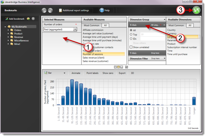
Here are the basic steps for creating a report in Business Intelligence:
- From Available Measures, drag-and-drop a measure to Selected Measures.
- From Available Dimensions, drag-and-drop a dimension to one of the axes in Dimension Group.
- Click the green button to run the report, or press F5.
Configure a Report in the Business Intelligence
The basic steps for configuring a report are as follows:
1. Select What to Report with Measures
Select what to report on with one or more measures:
- In the Available Measures section, select:
- The Most Common tab for the most commonly-used measures.
- The All tab for a list of all possible measures.
- Select a measure. For descriptions of all measures, click the blue help button to the right of each measure for contextual help.
- Drag-and-drop the measure to the Selected Measures section on the left. The measure displays with a drop-down below it.
-
In the drop-down, select the type of payment Exchange of money for goods and services in an acceptable amount to the customer where the payment amount has been agreed upon in advance. The customer can only pay with an accepted payment method. Each payment has an individual payment cost. status on which to base the report:
Option Description All The report displays all payment status types. Expected Subscriptions The report displays subscriptions and revenue expected for the future. These are calculated up to one year in advance under the assumption that there will be no subscription cancelations.
Paid (Aggregated) The report displays paid orders in aggregate, which includes revenue minus all returns for that period. For a description of returns, see Paid (Only Returns) below.
Paid (Only Refunds) The report displays refunds, which are payments initiated by Cleverbridge or the software provider back to the customer.
Paid (Only Returns) The report displays returns, which are refunds plus chargebacks. In other words, returns include all reverse transactions.
Note
Chargebacks are initiated by customers who do not recognize a charge on their credit cards or they are from fraudulent orders. The customer's payment provider issues a chargeback
A credit card chargeback, typically referred to as chargeback, occurs when a customer successfully disputes a transaction on their bank report. Unlike a refund, where Cleverbridge proactively returns the amount to the customer, a chargeback involves the customer's bank automatically withdrawing the amount from Cleverbridge's account. Cleverbridge can contest illegitimate claims, but the card organization makes the final decision. Successfully contested chargebacks still contribute to the chargeback ratio..Paid (Only Revenue) The report displays revenue from all paid orders regardless of later events, such as refunds or chargebacks. If an order
An agreement between a seller and a buyer to exchange goods and/or services for money. An order can: - contain multiple products and quantities; - have multiple financial transactions. A preorder authorization is considered an order. was refunded at a later date, it is still included in the period as if the order had the status Paid.Quotes The report displays quotes.
Unpaid The report displays unpaid orders, including quotes.
- If needed, add more measures.
- If needed, remove a measure by clicking the red x to the right.
Example
In the Most Common tab, you select Sales Revenue (Client). Any report generated with this measure will be a sales revenue report. In the drop-down, you select Paid (Aggregated). The report will display paid orders that include refunds, returns, and revenue.
2. Select How to Report with Dimensions
Select how to report the measures with one or more dimensions. You must have at least one dimension selected in the Dimension Group section for the report to run.
- Decide how to group the report, which is a way to customize the view of the report. In the Dimension Group section, there are two options:
- X-Axis — The horizontal axis of the report (when in chart form) is typically used most frequently for item selection.
- Y-Axis — The vertical axis of the report (when in chart form) acts as the secondary axis.
Example
You have Sales Revenue (Client) selected as the measure. You select Time as the dimension for the x-axis. The report displays the sales revenue numbers on the y-axis and the time increments, such as months, on the x-axis.
- Decide how to filter the report (optional), which is a way to include or exclude only a subset of returned data. Youc can select a filter in the Dimension Filter section.
-
In the Available Dimensions section, select:
- The Most Common tab for the most commonly-used dimensions.
- The All tab for a list of all possible dimensions.
- Select a dimension. For descriptions of all dimensions, click the blue help button to the right of each dimension for contextual help.
- Drag-and-drop the dimension to the X-Axis, Y-Axis, or Dimension Filter sections on the left. The dimension displays with more selectable options.
- If needed, further refine the dimension by selecting additional options.
- If needed, remove a dimension by clicking the red x to the right.
Tip
One of the most commonly used dimensions is Time, because that is how you select or change the length of time covered by the report, or how the returned data is grouped, such as by month, day, or hour.
3. Run Report
To run or refresh the report, click the  green button or press F5 on your keyboard. This returns the data in the results page.
Note
There are limitless possibilities for how you can configure a report. The steps above provide a general guideline.
Additional Report Settings
If needed, you can configure additional report settings that determine how the reports and data are calculated. For example, you can set the exchange rate time, currency, and time zone. To do this, in the Global Header, click Additional Settings. A window displays with the options.
Note
These settings are reset to default when you close and reopen Business Intelligence. If you want to save report settings different from the defaults, best practice is to save reports with custom settings as bookmarks.
If you wish to have custom defaults for all users in your company, contact Client Experience.
Measures Settings
In the Measures tab, select from the following options:
| Option | Description |
|---|---|
| Exchange rate time |
Select from which time perspective the report should display data when there is a currency conversion. The exchange rate is captured once per day.
WarningWith the Now option, the data for previous days will change, depending on the day you run the report, due to daily exchange rate fluctuations. ClearingPayments to clients and affiliates happens between the first and fifth business day of each month. The exchange rate time used for clearing is based on the day of the payment. However, note that in Business Intelligence this information should only be used as a snapshot and not for accounting purposes. |
| Currency | Select which currency to display report results for. The default currency displayed is taken from the Default base currency field in the Commerce Assistant's Account Setup. |
| Revenue Settings |
Select how to display revenue:
|
Time Settings
In the Time tab, select from the following options:
| Option | Description |
|---|---|
| Purchase reference time |
Select the time reference the report displays data for:
ExampleFinancial transaction is selected. On Monday, an order is placed by a customer. On Tuesday, the order is paid. The report displays the data for Tuesday, which is the day of the financial transaction. |
| Time zone | Select the time zone the report displays data for. |
| Week type |
Select whether the report is based on the following week types:
ExampleThree days of the week fall in Year 1. Four days of the week fall in Year 2. The week counts for Year 2.
ExampleThree days of the week fall in Year 1. Four days of the week fall in Year 2. The week is split between Year 1 and Year 2. |
| Customer contact reference time |
For customer contact reports, select the time reference the report displays data for:
|
Miscellaneous Settings
In the Miscellaneous tab, select from the following options:
| Option | Description |
|---|---|
| Test orders |
Select how to display data for test orders:
|
View and Work with Report Results
The following describes the various ways you can view and work with report results:
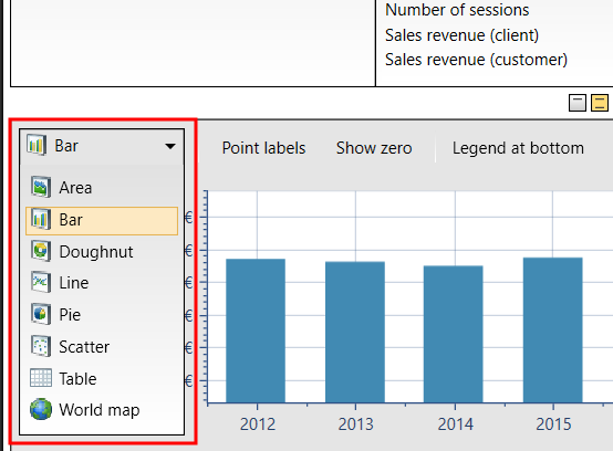
Display Type
You can select a display type for the report in the top left of the results pane. The options are:
- Area (only available for the Time dimension)
- Bar
- Doughnut
- Line (only available for the Time dimension)
- Pie
- Scatter
- Table
- World Map (only available for one measure and up to two dimensions, one of which must be the Country dimension)
Report Display Options
There are various report display options on the top of the results pane. The options vary according to the display type (area, bar, and so on). Click the button to turn on the following options:
| Display Option | Description |
|---|---|
| Animate |
Creates an animation effect when the report changes due to a refresh, a change of display type, and so on. |
| Point Labels |
Displays labels on the data, such as percentages on the pie chart. |
| Show Zero |
Starts the data points with 0. Otherwise, the data points start with the lowest rounded data point closest to the lowest number in the report. ExampleShow Zero is not selected. You run a report for sales revenue by language and select the Bar display type. The language with the lowest revenue is $25,175. The data points in the report begin with $20,000. |
|
Legend... |
Various positions for displaying the legend. |
| Export |
Various options for exporting and opening the report. |
| Cross Table |
Displays the data in a matrix, showing the interrelation between the two axes. This is only available for one measure and two dimensions. |
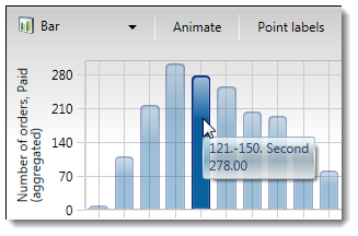
Tool Tips with Data
Hover the mouse pointer over the data, such as a bar in a bar chart, for a tool tip that displays information about the data.
Drill Down to More Specific Data
You can drill down through data layers to get more specific data in Business Intelligence.
Double-Click
Double-click to further drill down in the same report. This only works for the following dimensions, which have a hierarchical structure:
- Browser, with versions
- Country, with states
- Customer Contact Reason, with detailed reasons
- MVT campaigns, with candidates in a campaign
- Operating System, with version
- Parameter (for x-parameter The x-parameter is a variable appended to a URL that allows grouping and tracking orders for later reporting purposes. It also enables you to pass through data that you want to capture in the order process. X-parameters can also be used to control design elements based on the value of the x-parameter. revenue tracking), with the hierarchy for the selected parameter tree
- Payment Types, with subtypes
Example
You run a report for sales revenue by browser and select the Bar display type. You double-click the bar for Google Chrome. The report refreshes and displays all versions of Google Chrome.
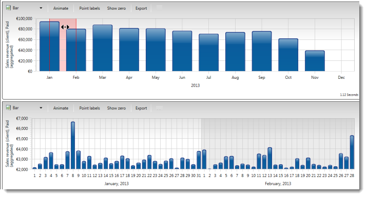
Highlight a Section of the Report
If you are running the report with the Time dimension, you can highlight a section of the report to open a more detailed report below it for the highlighted section. The report below displays the next level of detail, such as from year to month, or from month to day, and so on. To do this:
- In the results pane, select the Bar report option type.
- Click on a bar. A red line displays.
- To display more data for only that bar, release the mouse click. A second report with detailed data displays below.
- To display more data for a wider time period, drag the cursor over more bars in the report and release the mouse click. A second report with detailed data displays below.
- To further refine results:
- Hover the mouse pointer over the left or right edge of the highlighted section and drag the highlighting to a new position.
- Hover the mouse pointer over the highlighted section, and right-click. While holding the click, drag the entire highlighted section to a new position.
- Hover over the left or right edge of the highlighted section and drag the highlighting to a new position.
- Hover over the highlighted section, and right-click. While holding the click, drag the entire highlighted section to a new position.
Example
You run a report for sales revenue by the last year, grouped by month, and select the Bar display type. You highlight two bars of the report that represent two months: January and February. A detailed report displays below the report with data for each day of the highlighted two months.
Context Menu
Right-click the report results to view a menu with options to select a subset of data, such as All Countries or Top Languages. When selected, the report refreshes to display the data by that subset.
Example
You run a report for sales revenue. You right-click the report results and select Browsers. The report refreshes and now displays revenue by browser type.