Insights
Insights empowers you to analyze your subscription business comprehensively. Using the power of AI, Cleverbridge helps you predict your performance (Forecast), pinpoint anomalies in your operations (Anomaly Detection), and compare your subscription KPIs with similar companies (Benchmarks). To access Insights, go to the main menu of our web admin tool and click Insights.
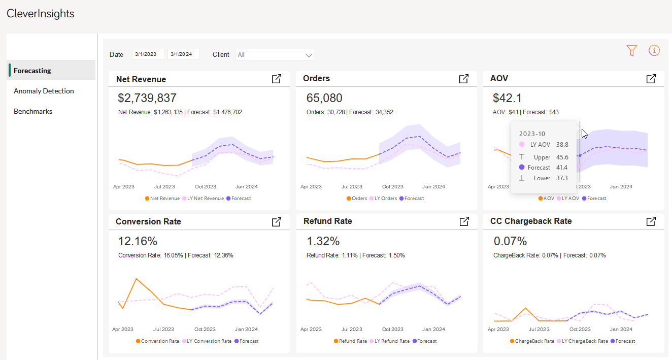
Check out the Key Terms for all the relevant KPIs available on the Insights dashboard.
Forecast
You can leverage your historical data to predict core performance metrics of your business. Each chart, by default, presents historical data for the past six months and forecasts behavior for the next six months.
You can extend the forecast period for up to a year. The forecasted data is calculated based on your historical data from the last two years. Data fluctuations, seasonality, and trends are considered with a correction factor that adds weight to the most recent months.
Since it is impossible to predict exact values for the future, the forecasted values run in an accuracy corridor that spans from 10% above to 10% below the exact predicted value.
For best results:
- Use the top filters to select the time range and client user.
-
Use the filter icon on the right side to fine-tune your forecast. For instance, forecast your data based on a specific country, product, or payment type
 Consolidates multiple payment methods into groups by the type of payment the customer uses, for example, Credit Card as a payment type that encompasses Visa Credit Card, Master Card Credit, Amex, in short: all credit cards.. Depending on the chart, the filter availability differs.
- Click on the metric title to expand the chart tile.
- Go to the detailed view of each metric by clicking the
 icon and selecting a custom Fiscal Year Start to review forecast by custom financial quarters and years.
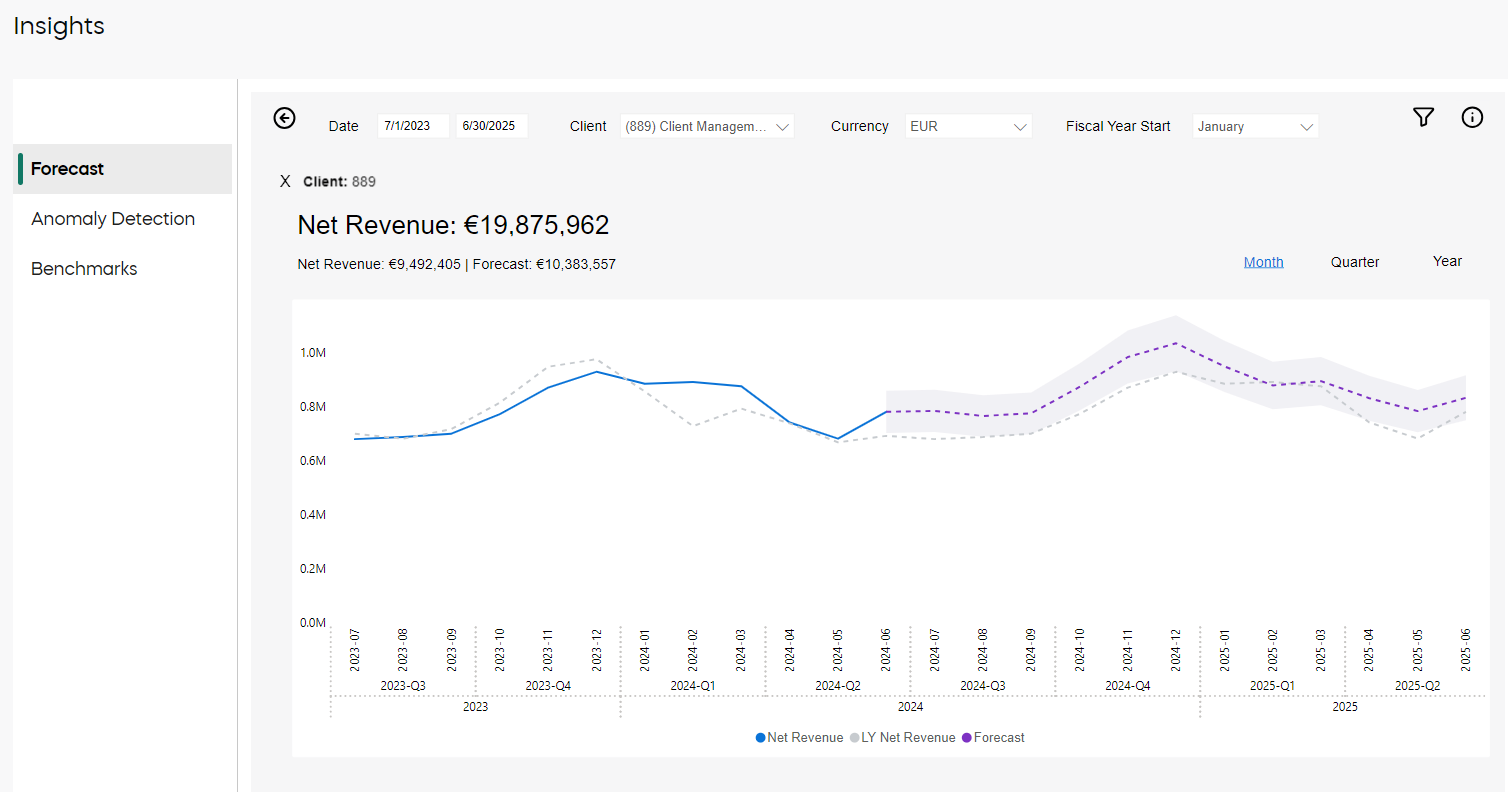

Note
Use the filters wisely, so that you feed a good set of data to the Insights engine. Excessive filtering may result in insufficient training data, and may affect the accuracy and reliability of the forecast.
Anomaly Detection
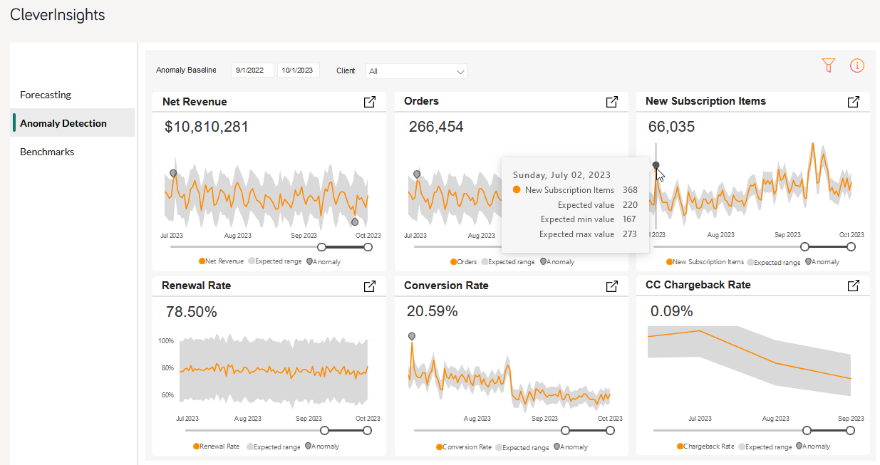
Examine your data for anomalies, such as unexpected spikes or dips, and leverage the power of AI to get possible explanations for the detected anomalies.
When the Insights engine scans your baseline (the time range you want to examine) it estimates an expected range for your data (a span in which your data is considered normal, without any deviation). The quantity of identified anomalies is influenced by the model's sensitivity level. A higher sensitivity indicates that the model is more alert to outliers, leading to the detection of more anomalies. Presently, the model's sensitivity is set at 70% to achieve a balanced ratio between false positives and significant events. By default, last 24 months are analyzed, as Cleverbridge experience showed that this span gives the most accurate results.
Inspect an Anomaly
To analyze your anomalies, perform the following steps:
- Define your anomaly baseline.
- Check exact values of an anomaly by hovering over the orange pins.

- Inspect possible explanations of the anomaly by clicking on the pin.
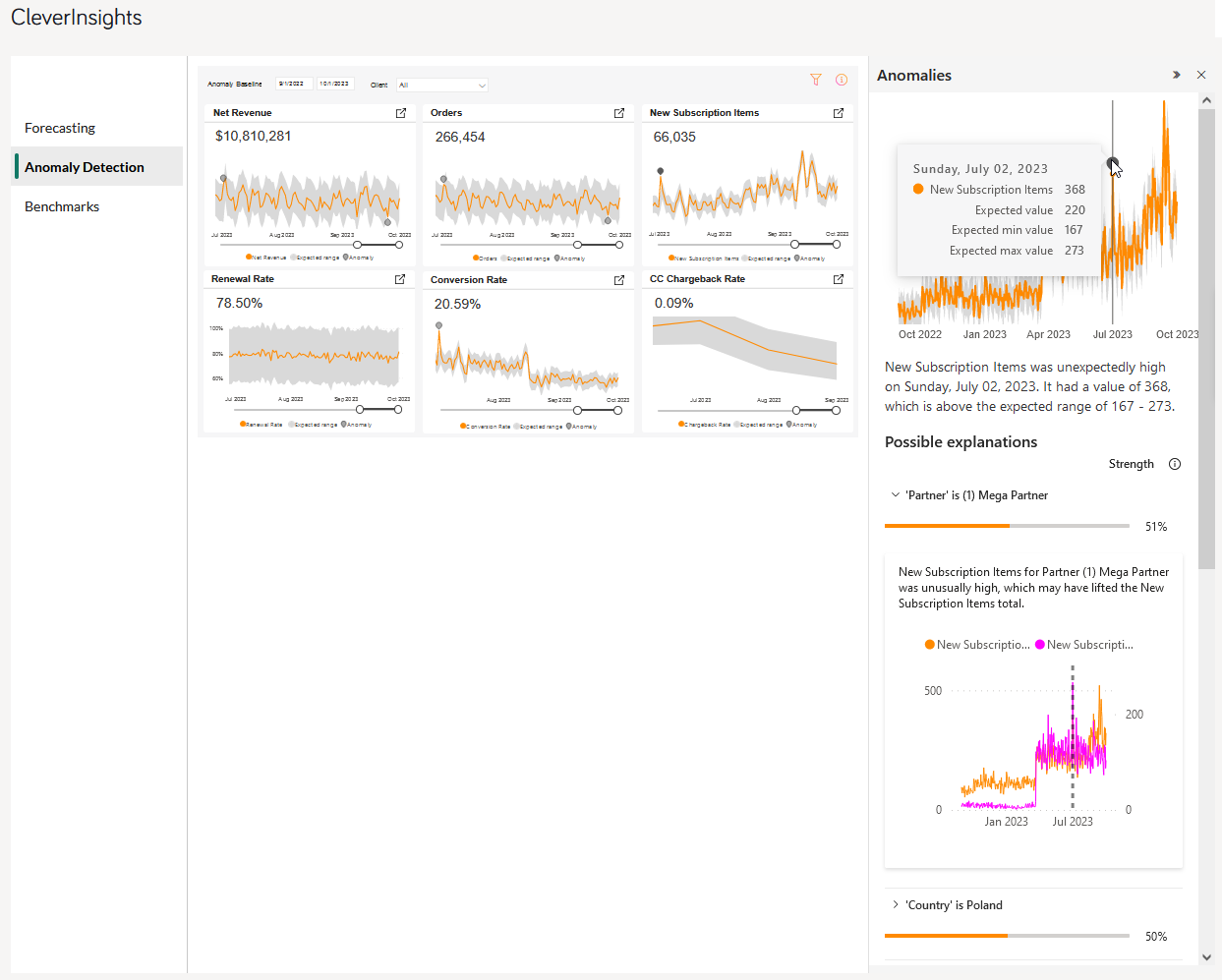

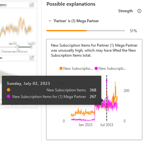
Example
The above image shows a client who sold an unusually high number of new subscription items on the 16th of April 2024. The client performed much better than expected (the data is beyond the expected range).
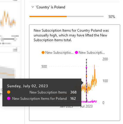
To inspect what happened, the client analyzes the details from that day. Charts in the Possible explanations section give hints:
- The strongest correlation (49%) of this event is linked to Mega Partner A company that buys your products in bulk for a discounted price and resells them to their customers for a profit. In legal terms, a partner is a regular customer as there is no partnership agreement with Cleverbridge in place., a reseller of this client. Mega Partner sold 2311 new subscription items that day, while the total number of sold items that day was 2651. What can it possibly mean? Since the client already knows the correlation with the partner, they can consider different options: maybe Mega Partner organized a one-day super sale that day, or maybe Mega Partner attended an event and sold so many products there.
- The other strong correlation (43%) with this record sale is linked to one particular country - United States. The client sold 1744 items in United States on that day. Was it a result of a special campaign targeted exclusively to the Polish market? Or was it also correlated with the record sales of Mega Partner? These are just example questions that the client can ask while analyzing the anomaly charts.
Get Alerts on Anomalies
When our Insights engine scans the past two years of data, it estimates an expected range for the client's data. If the actual value falls outside this range, it is considered an anomaly. The number of anomalies detected also depends on the model's sensitivity level. Higher sensitivity means smaller deviations from the expected range are considered anomalies.
Currently, we have set the sensitivity to 80% for AoV![]() Average Order Value, AOV in short, consists of the average value of all items within any given order. AOV is calculated as the net revenue divided by the number of orders paid and not reimbursed. and Refund Rate, and 70% for all other metrics. Anomalies Email Alerts are configured to notify users about anomalies in their data, prompting them to investigate the causes in a detailed report.
Average Order Value, AOV in short, consists of the average value of all items within any given order. AOV is calculated as the net revenue divided by the number of orders paid and not reimbursed. and Refund Rate, and 70% for all other metrics. Anomalies Email Alerts are configured to notify users about anomalies in their data, prompting them to investigate the causes in a detailed report.
Note
If you want to get the Anomalies Email Alerts turned on, contact Client Experience.
Best Practices
Depending on the chart, the filter availability differs.
Note
Use the filters wisely, so that you feed a good set of data to the Insights engine. Excessive filtering may result in insufficient data for an accurate anomaly detection. However, if you feed too much data (for example, too many previous years), your dataset may bee too outdated for meaningful detection.
Value Tip
Try different time ranges and other filters to find your best base for the analysis.
You can get different anomalies for the same period, depending on the baseline (time range) you set. For example, if your anomaly baseline spans two years (2021 and 2022), the expected range is calculated based on the data from these two years. If your baseline is just six months (Jan 2022–June 2022), the expected range takes into account the data only from these six months. Both baselines include the first half of the year 2022. However, because of a different baseline span, the anomalies found by Insights in these periods can be different.
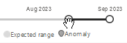
To zoom in and out the charts, drag and drop the dots at the edge of the gray slide at the bottom of each chart. This lets you adjust the time range you want to look at without changing the baseline. You can also move the selected range along the slide. To do it, drag and drop the middle of the selected range.
Benchmarks
Gain insight into the market behavior and compare your subscription business with other businesses operating on the Cleverbridge customer![]() An individual or business purchasing your product or service by placing an order through Cleverbridge. The customer is the end user of this product, as they are not allowed to resell the purchased products or services.
A customer is unique per client. If a customer purchases products or services from two different clients, there are 2 separate records of said customer. lifetime value (CLV) platform.
An individual or business purchasing your product or service by placing an order through Cleverbridge. The customer is the end user of this product, as they are not allowed to resell the purchased products or services.
A customer is unique per client. If a customer purchases products or services from two different clients, there are 2 separate records of said customer. lifetime value (CLV) platform.
Note
Metrics in Benchmarks include only subscription business; all one-time sales are excluded.
The analyzed time frame is always past 12 months. The data is presented on two tabs:
- As an overview, cumulatively for the past 12 months,
- As a trend, presenting each month values for your business and for cohort median.
The cohort includes all the businesses within the set market traits. Market traits work similarly to filters and include:
- Client - only one client can be selected at a time
- Currency
- ARR
- Business Category
- AOV
- Industry
- Region

Fine-tuning
Adjust the market characteristics to your situation, so you get a meaningful comparison of your performance. In other words, model a business segment![]() Defines the specific group of customers that an automation is targeting. that you want to be compared to by adjusting the market traits of the cohort.
Defines the specific group of customers that an automation is targeting. that you want to be compared to by adjusting the market traits of the cohort.
Example
A client selling yearly-billed subscription products, operating in a B2B model, with ARR reaching above 10 million EUR, wants to check how other businesses in his segment are performing.
The client specifies the following cohort traits:
- Client: Only one client can be selected at a time
- Currency: EUR
- ARR: Above 10 million
- Business Category: B2B
- AOV: ALL
- Industry: ALL
- Region: ALL
The client’s score is marked in blue.
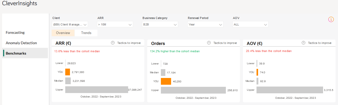
The charts show a big divergence in the compared businesses. The span between the client’s ARR and the highest (upper) ARR present in the cohort creates a disproportional comparison. The client sees a similar lack of proportion also on the Orders and AOV charts. Therefore, further tuning of the cohort is needed.
The client sees the biggest divergence among AOV, so they narrow down that trait to compare their KPIs to other businesses within the AOV range between 30–99 EUR.
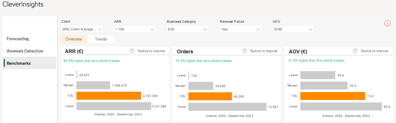
Now the traits are relevant, and the cohort is adjusted to the client’s situation. Moreover, the analysis shows the client performs better than the cohort median.
When the client changes the view to Trends, they can compare their own score with the cohort median per each month.
To find your best fit in the cohort, perform a similar tuning.