Create styling themes
Introduction
Styling options give you control over the visual design of your checkout, allowing you to customize fonts, colors, layout, and other elements for a consistent brand experience and a visually cohesive checkout process.
You can apply a theme to adjust the appearance of various elements, including emails and checkout pages.
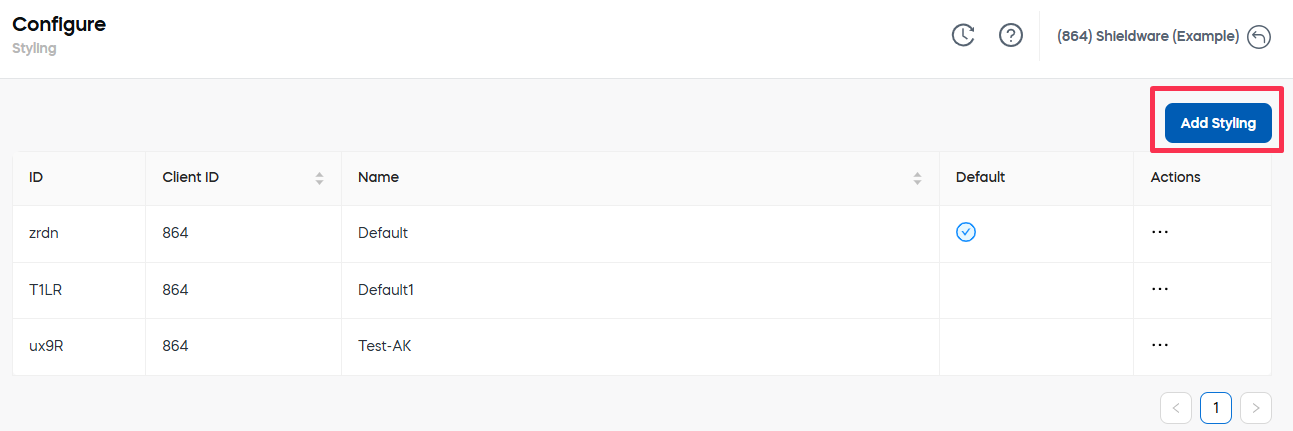
Access the styling configurations
-
In our web admin tool, go to Configure > Customer UX > Styling.
-
Click Add Styling.
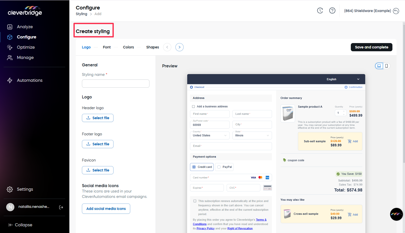
Create Styling page will emerge:
Define the settings
Logo settings
In the Logo tab, set up the following elements to align your checkout with your brand identity:
- General section: Define the Styling name (no spaces allowed).
- Logo section: Upload the header logo, footer logo, and favicon.
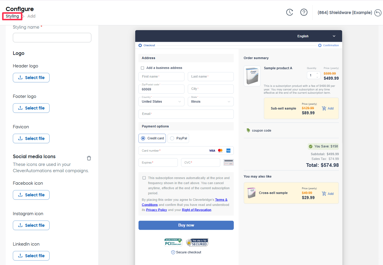
- Social media icons section: Click the Social media icons to upload dedicated file
Font settings
In the Fonts tab, customize the typography to ensure a cohesive and branded checkout experience:
- Base Font settings: Select the font family and size for the base font.
- Add custom font: Click the button to upload the font file. This is particularly to incorporate licensed, purchased or agency-provided fonts.
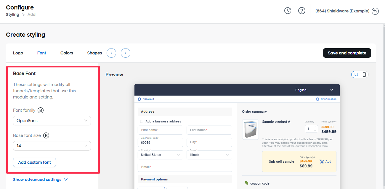
- Advanced settings: Click the Show advanced settings to expand the section and adjust font size, weight, line height, and letter spacing for:
- headlines.
- subtitles.
- body.
- caption text.
- button text.
Color settings
In the Colors tab, customize the checkout’s color scheme to match your brand.
To define the colors, expand corresponding section. Each section contains the basic settings and Show advanced settings link under which you can define the color variations.
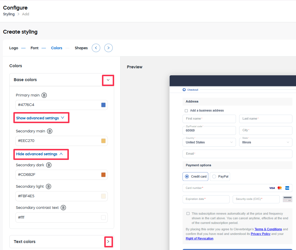
The following settings can be defined:
- Base Colors: Primary and secondary brand colors. Advanced settings define such color variations as:
- the light version.
- the dark version.
- the contrast text color.
- Text Colors: The primary and secondary colors of text elements. Advanced settings also define the colors of:
- text headers.
- text footers.
- disabled texts.
- Status Colors: Colors for status messages, such as errors, warnings, info, and success notifications. Advanced settings are available for every status and define:
- the light version.
- the dark version.
- the contrast text color.
- Background Colors: Determines the background colors used:
- by default.
- for promos.
- for headers.
- for footers.
- for selected elements.
- for the loader.
- Common Colors: Includes additional shared color settings used across different elements in the checkout for a unified appearance.
Shape settings
In the Shapes tab, adjust the border radius** to create either rounded or square elements, aligning the checkout design with your brand’s aesthetic.
Save the styling
When all the desired settings are defined, click the Save and complete button int he top right corner of the page.