Multi-Item
Multi-Item is a dashboard that presents a consolidated view of multi-item subscriptions based on subscription item![]() A subscription item is component of a subscription with its own set of attributes including price, description and feature set. count or different product mixes. The Net Revenue for Subscription Options chart, for example, showcases the revenue generated from a single-item subscription compared to a combination of two, three, or more subscription items, enabling you to determine an optimal offer for different product mixes to maximize transaction revenue. To access multi-item analytics, go to Analyze > Multi-Item in our web admin tool.
A subscription item is component of a subscription with its own set of attributes including price, description and feature set. count or different product mixes. The Net Revenue for Subscription Options chart, for example, showcases the revenue generated from a single-item subscription compared to a combination of two, three, or more subscription items, enabling you to determine an optimal offer for different product mixes to maximize transaction revenue. To access multi-item analytics, go to Analyze > Multi-Item in our web admin tool.
For a glossary of all subscription-specific terminology, see Subscription Glossary.
Note
The Multi-Item Analytics feature is the newest addition to the Cleverbridge platform. This feature is currently in its beta version.
Important
Multi-item orders based on a bundle setup on the Cleverbridge platform are not reflected in Multi-item Analytics on Subscription Commerce Manager as the combined products in a bundle use one bundle ID and do not retain their individual product IDs.
Important
You can access the subscription analytics embedded into our web admin tool once you complete the onboarding process successfully. For more information, contact Client Experience.
Tip
Like the Business Intelligence (BI) tool, the Subscriptions dashboard provides data to be used as a reference and not for accounting purposes. If you want to generate reports for accounting purposes, use the clearing reports available in Commerce Assistant (CA). For more information, see Important Information about BI Reporting.
Key Terms
| Key Terms | Description |
|---|---|
| Subscription Orders |
The number of subscription orders received as per different product mixes or subscription options. |
| Subscription Option |
The revenue generated or the number of subscription orders received as per a single-item subscription compared to a combination of two subscription items or three subscription items. |
| Product Mix |
The revenue generated or the number of subscription orders received as per actual product combinations. For example, product A sold alone, product B sold alone, or products A and B sold together. |
| Net Revenue |
Net revenue is the amount earned from different product mixes or subscription options after subtracting any applicable discounts and shipping costs, including Cleverbridge fees and affiliate |
Net Revenue
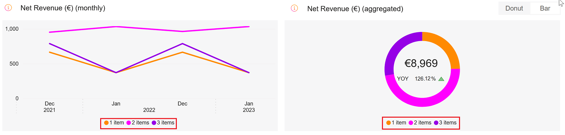
The Net Revenue charts display net revenue or subscription metrics data of different product combinations, such as revenue/subscription by product A sold alone, product B sold alone, or by selling product A and B together enabling you to determine the optimal product mix for maximum subscription/revenue.
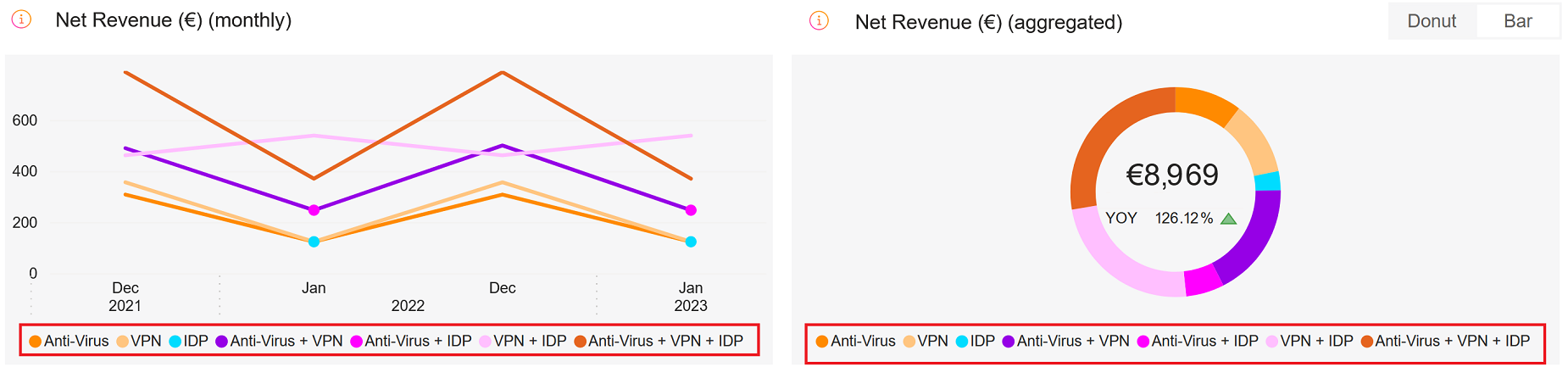
- Line Chart: The line chart displays the net revenue or subscription orders generated by different subscription options (1-item, 2-items, or 3-items) over a specified period. You can switch between monthly (default), daily, or yearly representations and drill down to explore the data in more detail. The chart's x-axis represents the time period, while the y-axis shows the net revenue or subscription orders.
- Donut Chart: The donut chart aggregates the net revenue or subscription orders by subscription option to show the relative share of each option in the overall revenue or orders. Each subscription option is represented by a different segment
 Defines the specific group of customers that an automation is targeting. of the donut chart. You can hover over each segment to see more details about that subscription option.
- Bar Chart: The bar chart aggregates the net revenue or subscription orders by subscription option and compares the current period to the same period in the previous year. You can use it to see how much progress has been made over time and which subscription options are contributing the most to that progress. The chart's x-axis represents the subscription options, while the y-axis shows the net revenue or subscription orders. Each subscription option is represented by a different color bar, with the current period shown as the solid color and the previous period shown as a patterned overlay. One-item, two-items, and three-item subscription options are included.
Subscription Options
The Subscription Options chart showcases the revenue\subsciptions from a single-item subscription compared to a combination of two subscription items or three subscription items, enabling you to determine the optimal subscription item number for maximum revenue/subscriptions.
- Line Chart: The line chart displays the net revenue or subscription orders generated by particular combinations of products in one subscription over a specified period. You can switch between monthly (default), daily, or yearly representations and drill down to explore the data in more detail. The chart's x-axis represents the time period, while the y-axis shows the net revenue or subscription orders.
- Donut Chart: The donut chart aggregates the net revenue or subscription orders by product mixes to show the relative share of each mix in the overall revenue or orders. You can use this chart to define the most popular combinations of products in a subscription. Each product mix is represented by a different segment of the donut chart, and you can hover over each segment to see more details about that product mix.
- Bar Chart: The bar chart aggregates the net revenue or subscription orders by product mixes and compares the current period to the same period in the previous year. You can use it to see how much progress has been made over time and which product mixes are contributing the most to that progress. The chart's x-axis represents the product mixes, while the y-axis shows the net revenue or subscription orders. Each product mix is represented by a different color bar, with the current period shown as a solid color and the previous period shown as a patterned overlay. You can switch between monthly (default), daily, or yearly representations.
The table below the charts in the Multi-Item Analytics page displays the complete view of your data including the various subscription options and possible product mixes.
Filters
In Multi-Item Analytics, the drop-down elements on the right-hand side and the filters on top of the metrics allow you to filter the results.
The applied filters are visible above the charts and can be cleared with the X sign.
You can filter the data by:
- Date Range: month-day-year
- Renewal Period: monthly, yearly, or other subscription running periods
- Currency: USD, EUR, or GBP
- Metric: Net revenue or Subscription Orders
- Selection: Product Mix or Subscription Option
- Subscription Option, Product Mix: 1, 2, or 3 item orders
- Product: name/ID of the product
- Interval: subscription item interval number
- Payment Exchange of money for goods and services in an acceptable amount to the customer where the payment amount has been agreed upon in advance. The customer can only pay with an accepted payment method. Each payment has an individual payment cost. Type: payment type Consolidates multiple payment methods into groups by the type of payment the customer uses, for example, Credit Card as a payment type that encompasses Visa Credit Card, Master Card Credit, Amex, in short: all credit cards. used by a customer An individual or business purchasing your product or service by placing an order through Cleverbridge. The customer is the end user of this product, as they are not allowed to resell the purchased products or services.
A customer is unique per client. If a customer purchases products or services from two different clients, there are 2 separate records of said customer.
- Payment Subtype: payment subtype used by a customer
- Region, Country: World region as defined by Cleverbridge and billing country
- Australia
- China
- Hong Kong
- India
- Indonesia
- Japan
- Malaysia
- New Zealand
- Philippines
- Republic of Korea
- Singapore
- Taiwan
- Thailand
- Vietnam
- Albania
- Austria
- Belarus
- Belgium
- Bosnia and Herzegovina
- Bulgaria
- Canary Islands
- Croatia
- Cyprus
- Czech Republic
- Denmark
- Estonia
- Finland
- France
- Germany
- Greece
- Hungary
- Iceland
- Ireland
- Italy
- Latvia
- Liechtenstein
- Lithuania
- Luxembourg
- Macedonia
- Malta
- Monaco
- Montenegro
- Netherlands
- Norway
- Poland
- Portugal
- Republic of Moldova
- Romania
- Russian Federation
- San Marino
- Serbia
- Slovakia
- Slovenia
- Spain
- Sweden
- Switzerland
- Ukraine
- United Kingdom
- Argentina
- Bolivia
- Brazil
- Chile
- Colombia
- Costa Rica
- Ecuador
- El Salvador
- Guatemala
- Honduras
- Mexico
- Nicaragua
- Panama
- Paraguay
- Peru
- Puerto Rico
- Uruguay
- Venezuela
- Canada
- United States
- Business Category: B2C or B2B
- MVT Multivariate testing (MVT) is a technique for testing two or more different variables in the checkout process to determine which variable creates more revenue or a higher conversion rate.: Multivariate testing campaign name/ID
- Partner A company that buys your products in bulk for a discounted price and resells them to their customers for a profit. In legal terms, a partner is a regular customer as there is no partnership agreement with Cleverbridge in place.: Another business that buys your products in a B2B model. Partners purchase An order made by a customer and the records associated with it. your products at a discount and then sell them to customers. Partners communicate directly with customers.
- X-Parameter The x-parameter is a variable appended to a URL that allows grouping and tracking orders for later reporting purposes. It also enables you to pass through data that you want to capture in the order process. X-parameters can also be used to control design elements based on the value of the x-parameter. Class: These are your predefined x-parameter classes. You can have a maximum of 5 x-parameter classes per client in the system. When you select an X-Parameter Class filter, it is applied to the metrics and the x-parameters under the x-parameter class appear in the X-Parameter filter drop-down, which you can further select to filter the metrics. You can select either one x-parameter class as a filter or all the available x-parameter classes.
- X-Parameter: X-Parameter represents origin of your revenue and subscriptions and there can be a maximum of 10 hierarchical x-parameters levels in the system. You can select X-Parameter filters to see the subscription/revenue reports. You can either select one x-parameter as a filter or all the available x-parameters. For more information on x-parameters, see Set Up X-Parameters, X-Parameter and Revenue Tracking Reporting, and Set Up Revenue Tracking.
| Cleverbridge Region | Countries |
|---|---|
| APAC |
|
| EUROPE |
|
| LATAM |
|
| NOAM |
|
| ROW | All others |
Tip
To quickly find a specific campaign in a long list of entries in the X-Parameter field, utilize the search feature by typing in either the name or ID of the campaign for which you wish to filter the data.