Filters and sorting tools
Analyze tab in SCM allows you to uncover trends, compare time periods, and break down key metrics. 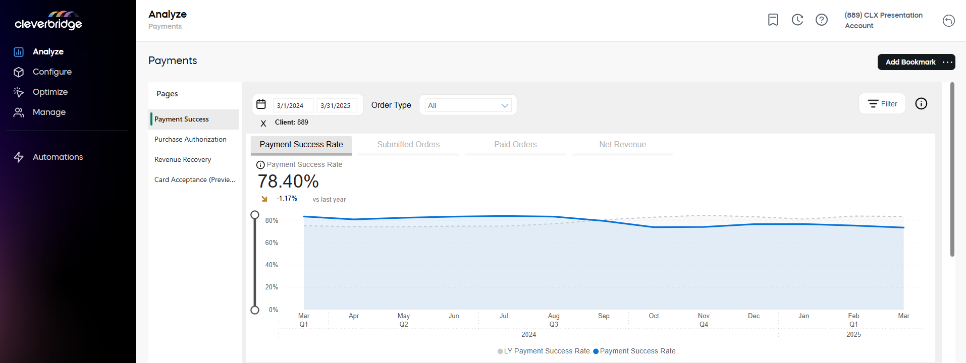
Whether you want to export summaries, drill into daily data, or highlight changes, these tools help you explore performance from multiple angles.
- Apply filters: Filter the report data by dedicated parameters.
- Adjust reporting period: Define the reporting period and adjust time granularity.
- Show as table: Turn charts into sortable tables, and compare metrics over time to better examine the details.
- Spotlight: View relative rate changes for selected timeframes in a convenient popup.
- Export Data: Download summarized insights in CSV or XLSX format for further analysis.
Apply filters
Filters narrow down the data included in all reports on the dashboard. They let you focus on a specific segment (for example, one product, specific countries or payment methods) without changing how results are grouped. Basically, filters limit which records are included in the calculation of your metrics.
While a specific set of filters depends on a specific functionality, the basic functionality is the same for all dashboards and for the Report Builder.
Built-in filters
To define a built-in filter:
- Open the panel: Click the Filter button in the top right corner of the page.
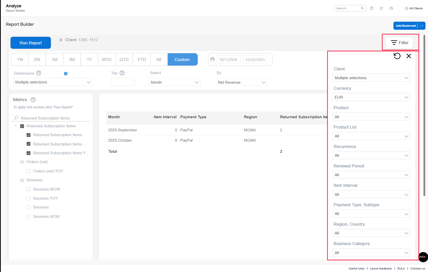
- Select filter: To filter by one or more parameters, open the drop-down and select the value(s). If a filter supports multiple values, you can select more than one option (for example, multiple clients or countries) to compare a broader segment in a single report.
 To include all records, don’t apply a filter and leave the value set to All.
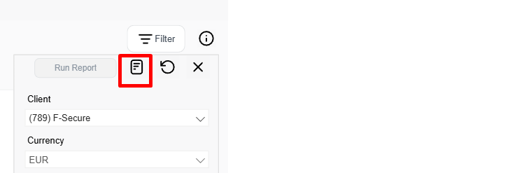
Text search filters
Text-search filters let you enter a list of comma-separated values and control how they affect the report results. You can use them to include only matching records or to exclude matching records from the report/dashboard. These filters are available
-
Open the panel: Click the Filter button in the top right corner of the page. Then click the Open Text Search icon.
-
Select filter: Type your comma-separated values into the relevant text field.
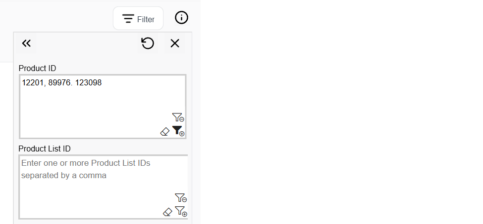
To include all records, leave the text field empty. -
Choose to include or exclude: Use the funnel icon to control how the values are applied:
+ (include): the report/dashboard shows only records that match the entered values.
− (exclude): the report/dashboard removes records that match the entered values.noteText search filters include matching values by default (+). Click the funnel icon to switch to exclude (−).
Manage defined filters
As soon as you have added a new filter, a clock icon appears next to it. This means that the filter has been selected but has not yet been applied to the report.
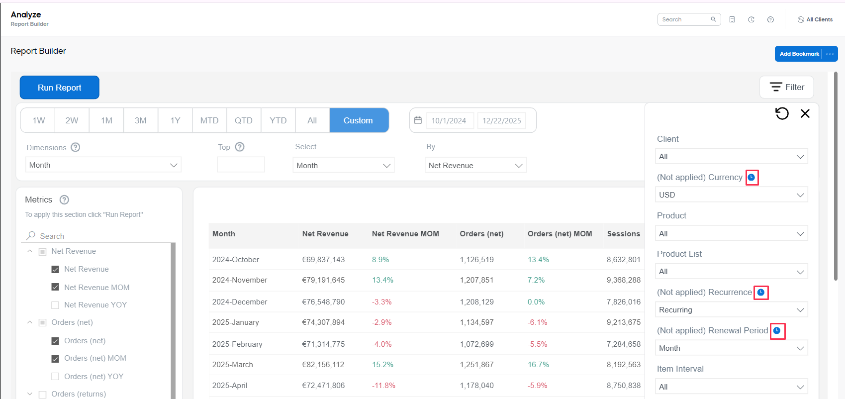
- To apply your changes, click the Run Report button before you close the filters.
- To clear your filter changes and return to defaults, use the arrow-shaped button to reset the filters panel.
- To exit the filters panel without additional changes, select X button or click beyond the filter area.
When the filter is applied, the setting becomes visible next to the Run Report button. 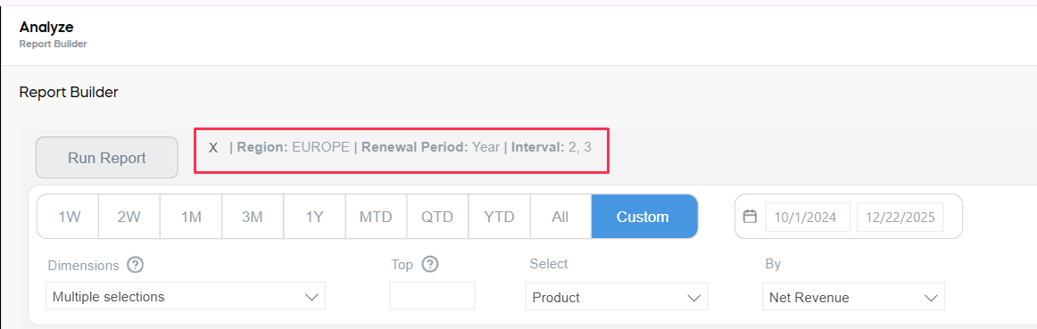
After you have run the report with selected filters at least once, you can continue modifying the report – this filters will be applied until you deliberately update them.
Adjust reporting period
Use date selector
Regardless of the chosen representation, you can use the quick filters at the top of the chart, or manually select a custom date range to tailor the time period for your analysis.
- 12M: Last 12 full months prior to the current report date. For example, if today is June 5, the report will cover July 1 of the previous year through May 31 of the current year.
- LY (Last Year): The previous full calendar year. For example, if today is June 5, the report will cover January 1 through December 31 of the previous year.
- LM (Last Month): The previous full calendar month. For example, if today is June 5, the report will cover May 1 through May 31 of the current year.
- 30D (Last 30 Days): The 30 days leading up to the most current finished date. For example, if today is June 5, the report will cover May 5 through June 4 of the current year.
- 7D (Last 7 Days): The 7 days leading up to the most current finished date. For example, if today is June 5, the report will cover May 28 through June 4 of the current year.
- 1D (Yesterday): The most current finished date. For example, if today is June 5, the report will cover June 4 of the current year.
- MTD (Month to Date): One calendar month back from the most current finished date. For example, if today is June 5, the report will cover May 4 through June 4 of the current year.
- YTD (Year to Date): One calendar year back from the most current finished date. For example, if today is June 5, the report will cover the period from June 4 of the previous year through June 4 of the current year.
- ALL: All available data, covering the entire period in which at least one campaign has recorded activity.
- Custom Selection: Click the calendar icon to manually select any desired date range.
Change time granularity
Easily shift the level of detail in your data view—switch to match your analysis needs.
- Go to the Analyze tab.
- Hover over the right-hand corner of the graph to activate the three-dot menu.
- Use the up and down arrows to change the level.
::: info [Example]
When the axis is showing yearly intervals, click the down arrow to change to quarterly intervals.
 :::
:::
Drill down to a day level
Use the drill-down tool to navigate from higher-level summaries down to daily data points for deeper insight:
- Go to the Analyze tab.
- Hover over the right-hand corner of the graph.
- Click the double arrow until you see daily analytics.

Expand levels
Quickly reveal all nested levels in your data with a single click to understand the full breakdown across time intervals:
- Go to the Analyze tab.
- Hover over the right-hand corner of the graph.
- Click the split arrow to expand all levels down in the hierarchy.
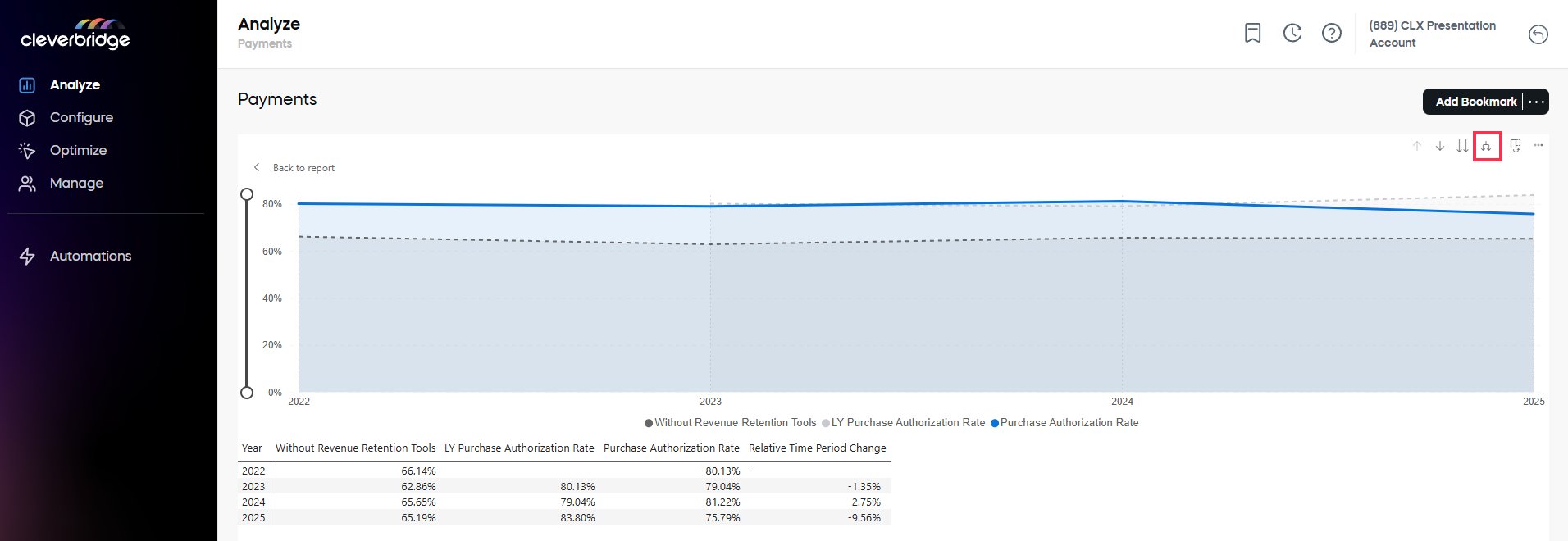
Show as table
Compare your metrics across timeframes to spot changes and trends:
Applies to all metrics in Analyze.
- Go to Analyze, then select the relevant tab.
- Pick an item on the graph.
- Hover in the right-hand corner to activate the three-dot menu.
- Select Show as a Table.
- Scroll down to view the data sorted in a table.
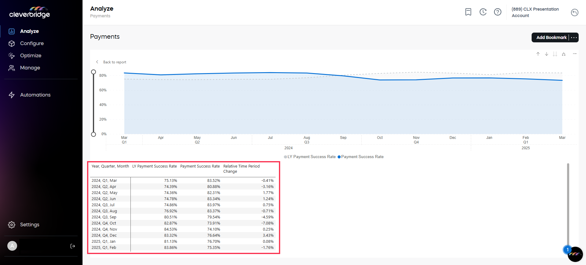
Only for Payment Success Rate and Purchase Authorization Rate:
A new column Relative Time Period Change has been added.
Depending on the selected time granularity, you see either:
- Year-over-Year (YoY)
- Quarter-over-Quarter (QoQ)
- Week-over-Week (WoW)
- Day-over-Day (DoD)
In SCM:
- Go to Analyze, then select the relevant tab.
- Pick an item on the graph.
- Hover in the right-hand corner to activate the three-dot menu.
- Click Show as a Table.
A new column, "Relative Time Period Change" appears. 
Perfect! Here’s how you can integrate both features—hover tooltips and click-to-filter—into a single, cohesive section. I’ve titled it “Interactive Chart Exploration”, with two clearly marked subsections: Hover for Details and Click to Filter Table. This structure aligns with the tone and formatting of the rest of your article while keeping things clear and user-focused.
Drill-down for details
Dive deeper into data directly from the charts with intuitive hover and click interactions.
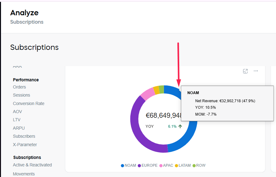
Hover for details
Get instant insights by hovering over any point on the chart. The tooltip shows detailed metric values for that time period—no clicks required. Move your mouse over a chart (line, bar, or pie), and a tooltip will display the key figures, allowing you to compare points over time at a glance without affecting the view.
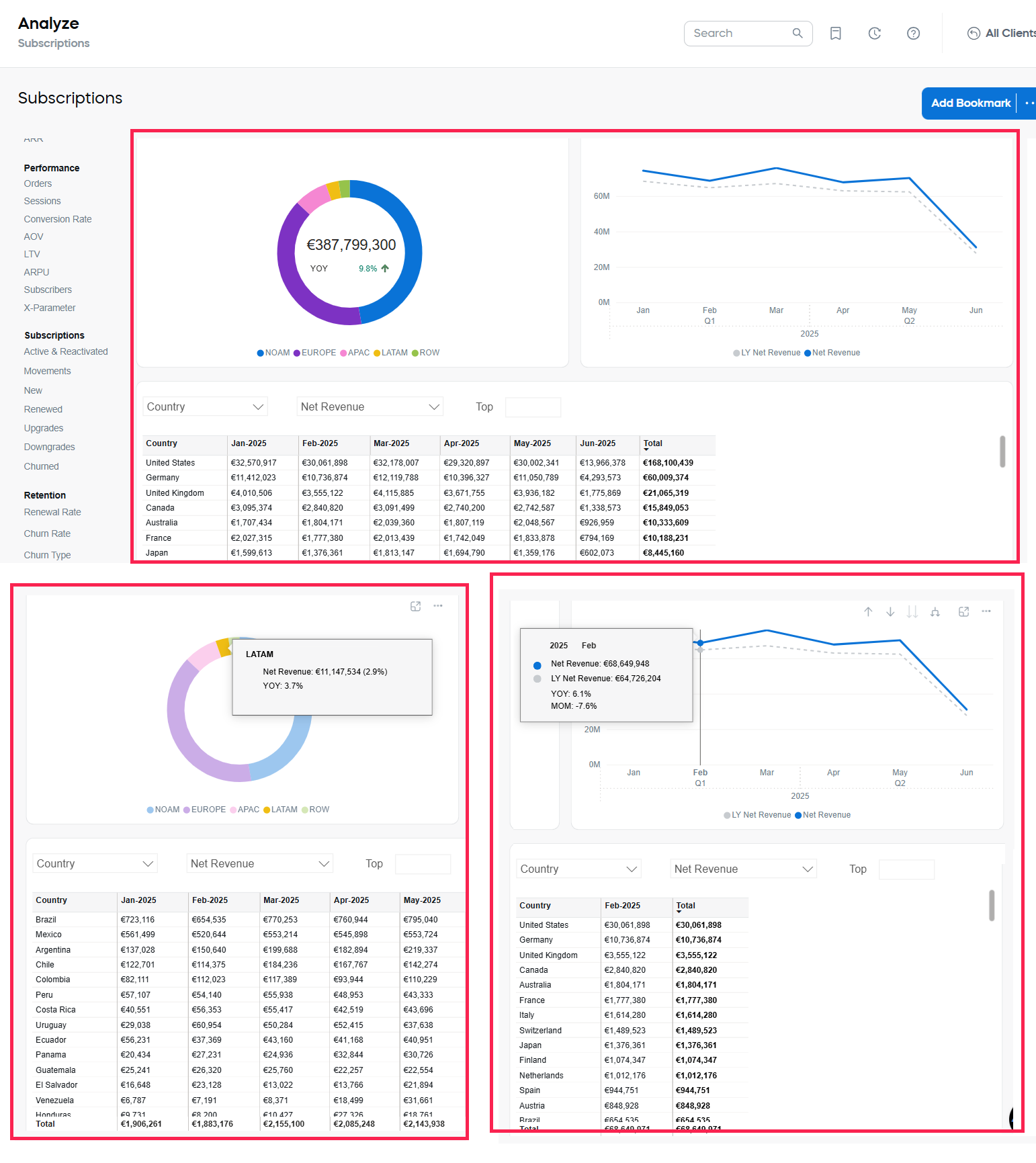
Click to filter table
Want to narrow your view? Click a data point on the chart to instantly filter the table below it.
- Go to the Analyze tab.
- Navigate to a chart.
- Click a specific point (e.g., February 2025).
- The table below updates to show only the data for that selected period.
Show Top N values
For dashboards with a single metric, you can show the Top N values in generated tables wherever you can select a dimension. 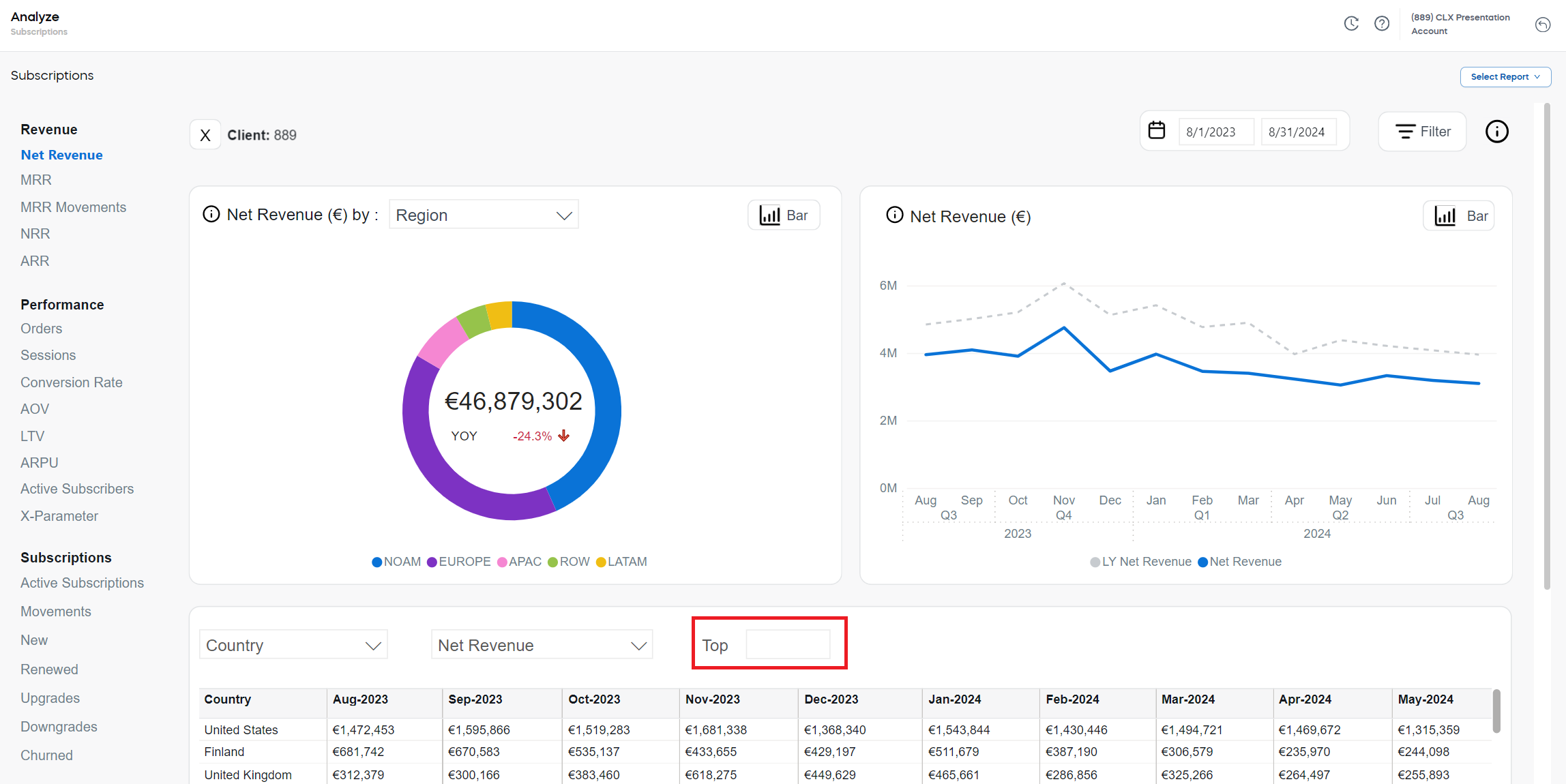
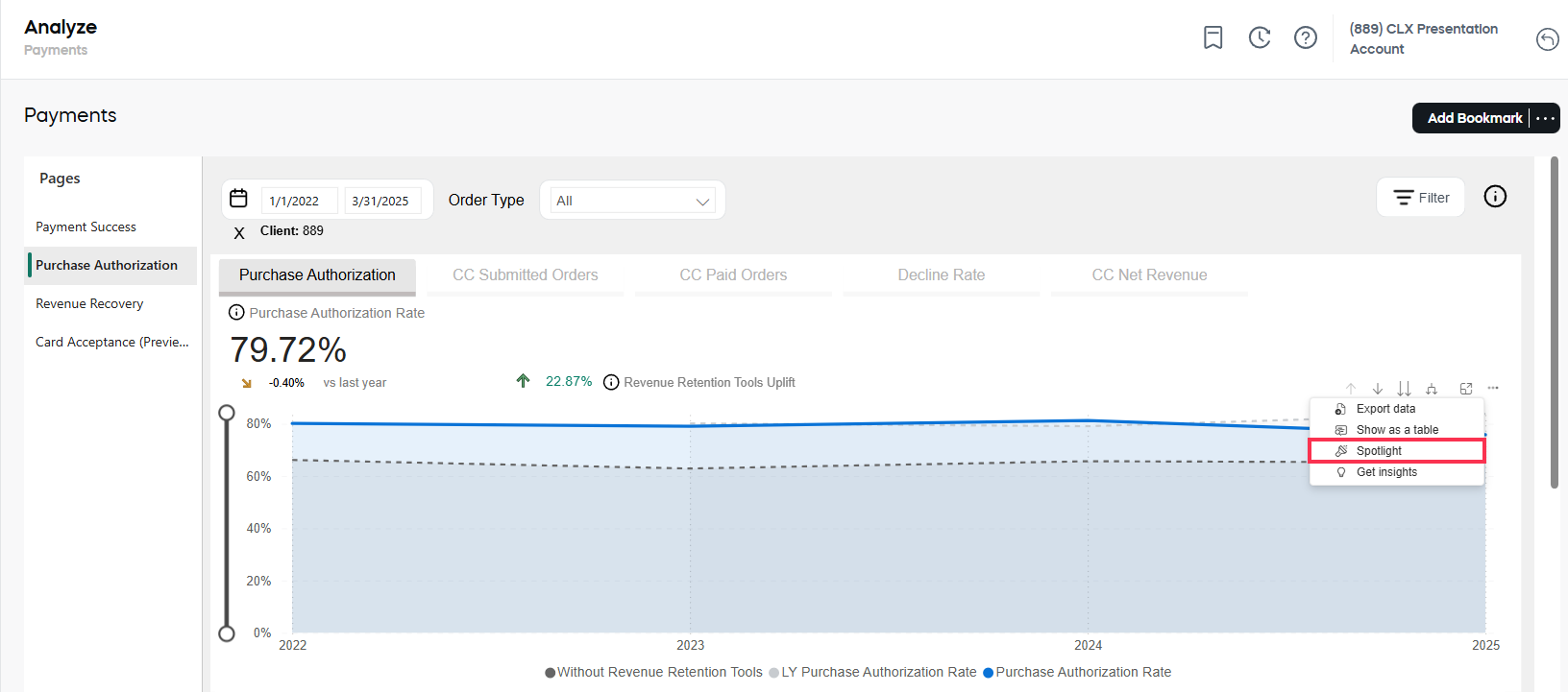
Spotlight
Highlight and compare performance changes over time with the relative rate change displayed in relation to:
- Last Year
- Last Month
In SCM:
- Go to Analyze, then select the relevant tab.
- Hover in the right-hand corner to activate the three-dot menu.
- Click Spotlight.
View the details for the selected time in a popup.
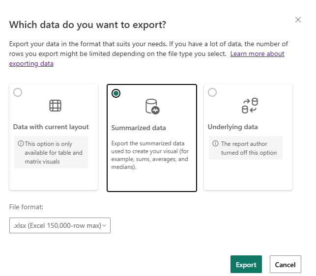
Export data
Quickly download aggregated data (for example, sums, averages, medians) as a CSV or XLSX file to share insights outside the platform:
- Go to Analyze, then select the relevant tab.
- Pick an item on the graph.
- Hover in the right-hand corner to activate the three-dot menu.
- Click Export data.
By default, your export is saved to your local Downloads folder.
Only summarized data is available, as the source for the report is already aggregated. The dataset does not contain subscription- or purchase-level information.