Subscription analytics
Understanding your subscription business begins with data. The Subscriptions metrics, available in SCM and through customizable reports, provide essential insights to help you track performance, identify trends, and make informed decisions.
The Subscriptions dashboard is intended for reference purposes only. For accounting-related reports, use the clearing reports available in Commerce Assistant.
Access subscription data
You can view the reports based on the subscription metrics in SCM under Analyze > Subscriptions and through customizable reports in the Report Builder.
Access to subscription metrics is granted after completing the onboarding process. For assistance, contact Client Experience.
Analytics related to successful orders and purchases, as well as new and renewed subscriptions, along with their associated revenue, profit, or loss, typically do not include data related to the items that were subsequently returned (for example, due to fraudulent transactions, chargebacks, or refunds). See specific metric description for more details.
Subscription charts and tables
To help you analyze your subscription business, we have organized the Subscriptions analytics into sections reflecting different stages and aspects of the subscription lifecycle, business performance, and customer retention, as described-below.
For each report on these pages you can apply filters and manage the dashboards, as described at the bottom of this article.
Revenue section
The Revenue section provides a comprehensive view of subscription revenue performance, allowing users to explore how income is generated, retained, and changed over time. It includes metrics such as Net Revenue, Monthly Recurring Revenue (MRR), Annual Recurring Revenue (ARR), Net Revenue Retention (NRR), and MRR Movements supported by interactive charts and tables that allow filtering by various business dimensions and time intervals. These tools help you monitor financial health, uncover growth opportunities, and evaluate the impact of customer behavior on recurring income.
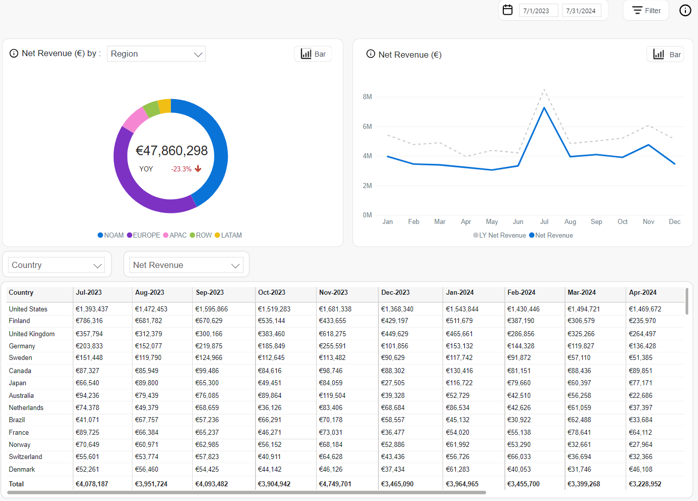
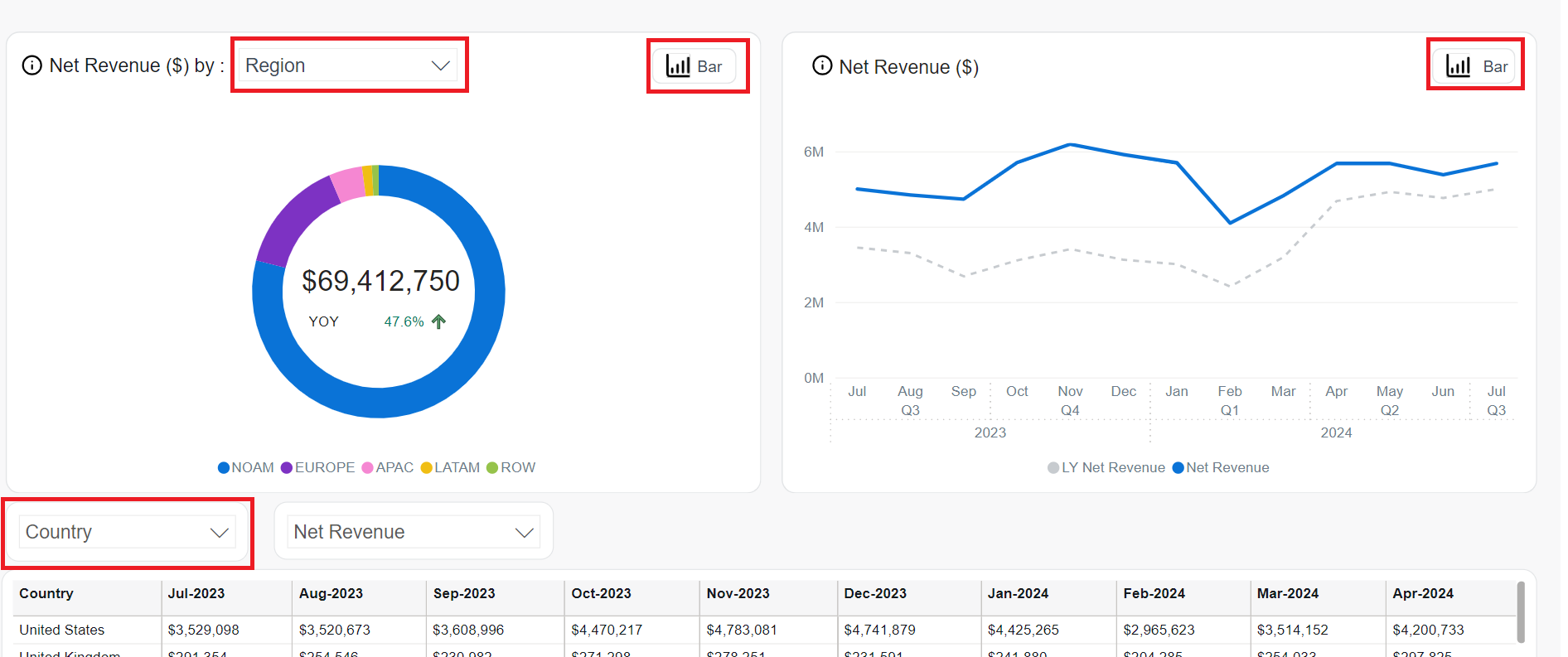
Net Revenue
Net Revenue is the total amount that subscribers paid to Cleverbridge based on the exchange rate at the time of transaction excluding tax. This value subtracts any discounts or shipping costs but includes Cleverbridge fees and affiliate commissions.
It can be analyzed using Net Revenue analytics described below.
The Net Revenue by chart offers a flexible view of revenue performance, allowing users to analyze net revenue across various business dimensions. The chart is available in two visual formats: donut and bar, and can be filtered by selectable dimensions such as Client, Region, B2B / B2C, Renewal Period, and Recurrence.
-
Donut Chart emphasizes the proportional contribution of each region to the total net revenue. The center highlights the total net revenue for the selected period and the year-over-year (YOY) growth percentage, offering a quick visual of overall performance and regional share.
-
Bar Chart highlights the absolute revenue values per region, comparing the current period’s Net Revenue with the same period last year (LY Net Revenue). This format makes it easy to spot YOY growth or decline for each region.
Both views use the same underlying data and allow users to analyze regional performance either as a share of total revenue or in direct year-over-year comparison.
The Net Revenue chart can be presented as a bar chart (quarterly view) or a line chart (monthly view).
Presents the company’s revenue performance over time, with options to view the data either by month or by quarter, depending on the desired level of granularity. Users can toggle between:
-
Line Chart: Displays monthly net revenue trends alongside last year’s figures:
- Solid blue line: Net Revenue for each month in the current year.
- Dashed grey line: LY (Last Year) Net Revenue for comparison.
-
Bar Chart: Summarizes revenue data at the quarter level:
- Blue bars: Current year’s Net Revenue per quarter
- Grey bars: LY Net Revenue for the same quarters
The Net Revenue table provides a flexible, data-rich view of revenue trends across time. Users can tailor the display using the following controls:
- Dimension Selector: Allows filtering by attributes such as Client, Product, Product List, Recurrence, Renewal Period, Payment Type, Region, and more.
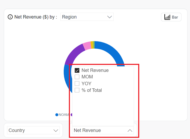
- Metric Selector: Offers additional performance metrics beyond Net Revenue, including:
- MoM: Month-over-Month change.
- YOY: Year-over-Year comparison.
- % of Total: Relative contribution to overall revenue.
- Top Filter: Enables filtering by top-performing entities within the selected dimension.
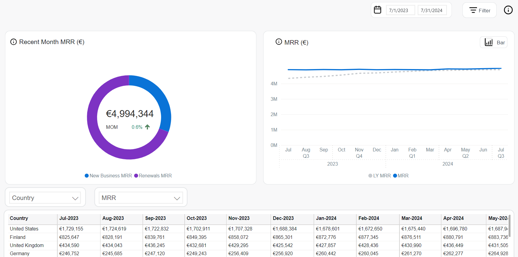
MRR
Monthly Recurring Revenue (MRR) is client's subscription-based revenue normalized into a monthly amount. The value helps tracking short-term business performance regardless of billing frequency. This is particularly useful when annual plans or seasonal effects could distort revenue trends in shorter periods.
The following tools can be used to analyze MRR values:
The Recent Month MRR chart visualizes the total MRR for the most recent month, broken down into two categories:
- New Business MRR: MRR generated from newly activated subscription items.
- Renewals MRR: MRR generated from renewed subscription items.
The chart is presented as a donut, showing the proportion of each type in total MRR. The center displays the total MRR and month-over-month (MoM) percentage change with an up/down arrow indicator.
This view helps monitor the balance between new revenue acquisition and recurring revenue retention.
The MRR chart provides a visual overview of recurring revenue over time and supports two display formats: line and bar.
-
Line Chart: Displays monthly trends.
- Solid blue line: Current MRR per month.
- Dashed gray line: MRR from the same period last year (LY MRR).
-
Bar Chart: Displays quarterly performance.
- Blue bars: Current year’s MRR per quarter.
- Gray bars: Last year’s MRR for the same quarter.
The MRR table provides detailed revenue figures across countries and time. It includes interactive controls for customizing data views:
- Dimension selector: Allows filtering by attributes such as Client, Product, Renewal Period, Interval, Region, and others.
- Metric Selector: Enables display of different metrics, including:
- MRR: Default monthly recurring revenue.
- MoM: Month-over-month percentage change.
- YOY: Year-over-year growth.
- % of Total: Share of each row relative to total MRR.
- Top Filter: Filters the table to show only top-performing items within the selected dimension.
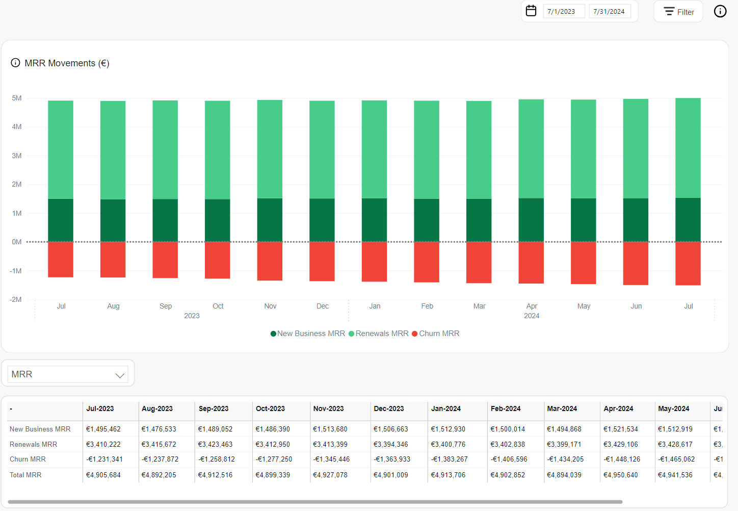
MRR Movements
MRR Movements reflect the changes in Monthly Recurring Revenue by breaking down the components that increase or decrease the total value over time. These movements help identify whether MRR growth is driven by new subscriptions, renewals, or affected by churn.
The following analytics tools support MRR movement analysis:
The MRR Movements chart is a stacked bar visualization showing the monthly composition of recurring revenue. It breaks down the total MRR into three key categories:
- New Business MRR (dark green): Revenue generated from newly activated subscriptions in the reporting period.
- Renewals MRR (light green): Revenue retained from renewed subscriptions in the reporting period.
- Churn MRR (red): Revenue lost due to subscription cancellations or expirations in the reporting period.
Each bar represents the net change in MRR for a given month, with churn values shown below zero to highlight their subtractive effect.
The MRR Movements table presents monthly values for each MRR component in tabular format. It includes interactive metric controls for detailed analysis.
Metric selector enables switching between available metrics:
- MRR: Displays absolute values for New Business, Renewals, and Churn.
- MoM: Shows the month-over-month changes for each MRR type.
- YOY: Displays year-over-year comparison of movement metrics.
This table provides transparency into recurring revenue composition and supports pattern identification over time.
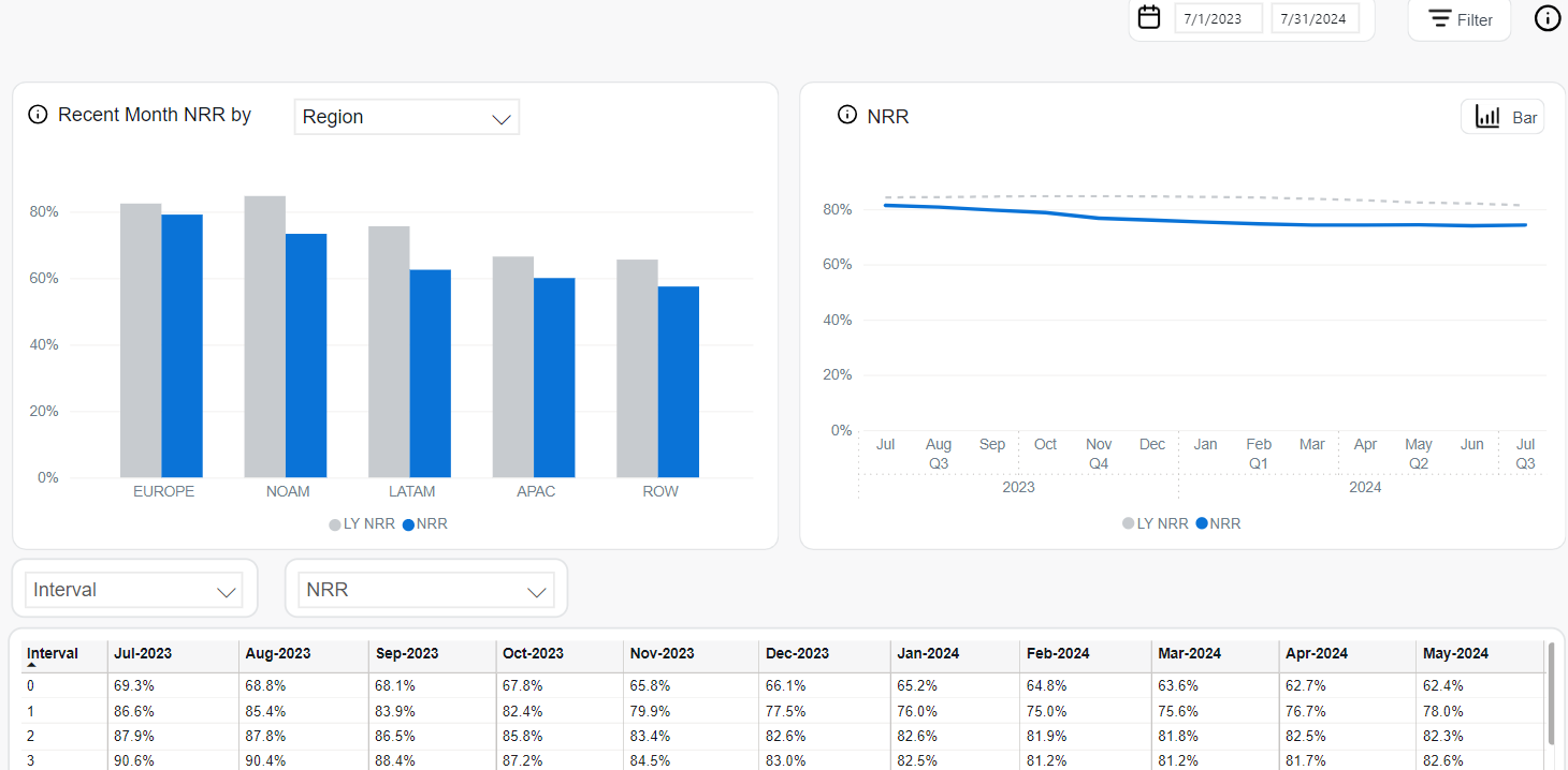
NRR
Net Revenue Retention (NRR) measures the percentage of recurring revenue retained from existing customers over time, reflecting changes in MRR due to expansion, contraction, and churn over a given period. It is a key performance indicator for the long-term health and stability of a subscription-based business.
The NRR is calculated as: [(Starting MRR + Expansion – Contraction – Churn) / Starting MRR] × 100%.
The following analytics tools are available to assess NRR performance:
The Recent Month NRR chart displays NRR for the most recent month across a selectable business dimension such as Region, Client, Product, or Payment Type.
- NRR (blue bar): Net Revenue Retention for the current month.
- LY NRR (gray bar): Net Revenue Retention from the same month last year.
This bar chart helps identify changes in customer value retention across key segments over time.
The NRR chart provides a visual trend of net revenue retention over time and is available in two chart types: line and bar.
-
Line Chart: Displays monthly retention values.
- Solid blue line: NRR for each month in the current period.
- Dashed gray line: NRR for the same period last year.
-
Bar Chart: Summarizes NRR by quarter.
- Blue bars: Current quarter NRR.
- Gray bars: Last year's NRR for the same quarter.
This chart helps visualize retention trends and seasonal patterns in customer revenue behavior.
The NRR table provides interval-based tracking of retention rates across the selected time period, enabling detailed cohort analysis.
- Dimension Selector: Filters NRR by attributes such as Interval, Client, Product, Payment Type, and more.
- Metric Selector: Enables switching between:
- NRR: Retention rate per interval or segment.
- MoM: Month-over-month change in NRR.
- YOY: Year-over-year comparison.
- Top Filter: Limits the view to top-performing segments.
ARR
Annual Recurring Revenue (ARR) is the annualized equivalent of Monthly Recurring Revenue (MRR). It provides a forward-looking view of subscription revenue, helping estimate yearly revenue performance based on current recurring income.
The following analytics tools can be used to explore ARR trends:
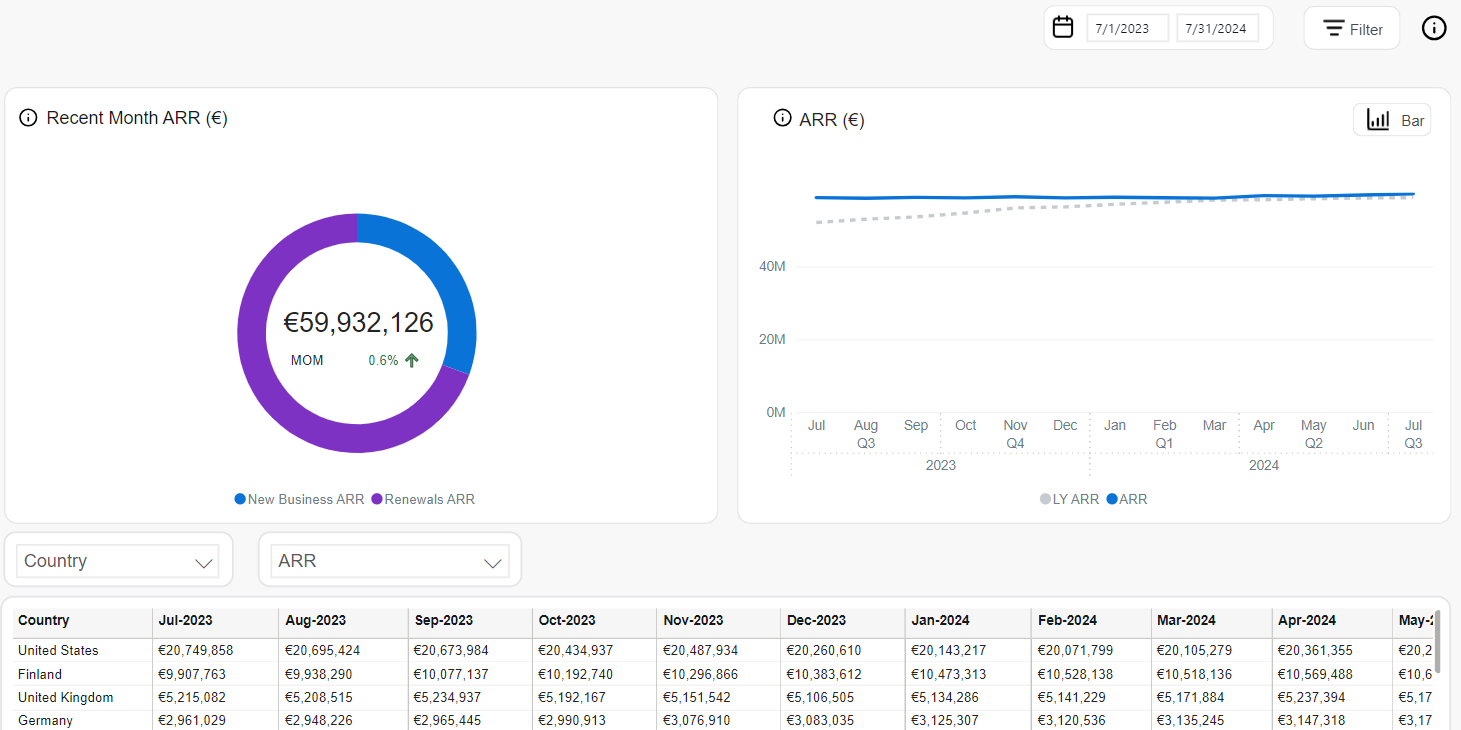
The Recent Month ARR chart displays the total ARR for the most recent month, segmented by revenue source.
- New Business ARR: ARR generated from newly activated subscriptions.
- Renewals ARR: ARR generated from renewed subscriptions.
The chart is presented in a donut format showing the proportional contribution of each component. The center displays the total ARR and the month-over-month (MoM) percentage change, indicated with an upward or downward arrow.
This view helps assess the balance between new revenue and retention-driven ARR contributions.
The ARR chart shows recurring annual revenue trends over time and is available in two display formats: line and bar.
-
Line Chart: Presents ARR trends on a monthly basis.
- Solid blue line: Current period ARR.
- Dashed gray line: ARR from the same month last year (LY ARR).
-
Bar Chart: Summarizes ARR performance by quarter.
- Blue bars: ARR for each quarter of the current year.
- Gray bars: ARR for the same quarters of the previous year.
The ARR table presents detailed ARR values over time, segmented by country or other selectable business dimensions.
- Dimension Selector: Allows filtering by attributes such as Country, Client, Product, Renewal Period, Interval, and more.
- Metric Selector: Enables switching between available metrics:
- ARR: Default annual recurring revenue.
- MoM: Month-over-month change in ARR.
- YOY: Year-over-year comparison.
- % of Total: Share of each entry relative to total ARR.
- Top Filter: Enables focus on the top-performing segments.
Performance
The Performance section provides a comprehensive view of your subscription business’s key revenue and engagement indicators. It equips you with actionable insights across the entire customer lifecycle from initial session to order conversion, recurring revenue, and long-term customer value. Through a series of interactive charts and tables, you can evaluate performance trends, segment metrics by business dimensions, and identify opportunities to optimize growth, retention, and monetization.
Orders
Orders represent the number of paid purchases, including free registrations, within the selected period. The count excludes detected fraudulent transactions, chargebacks, and fully refunded orders, whether refunded all at once or item by item over time.
The following tools support order volume analysis:
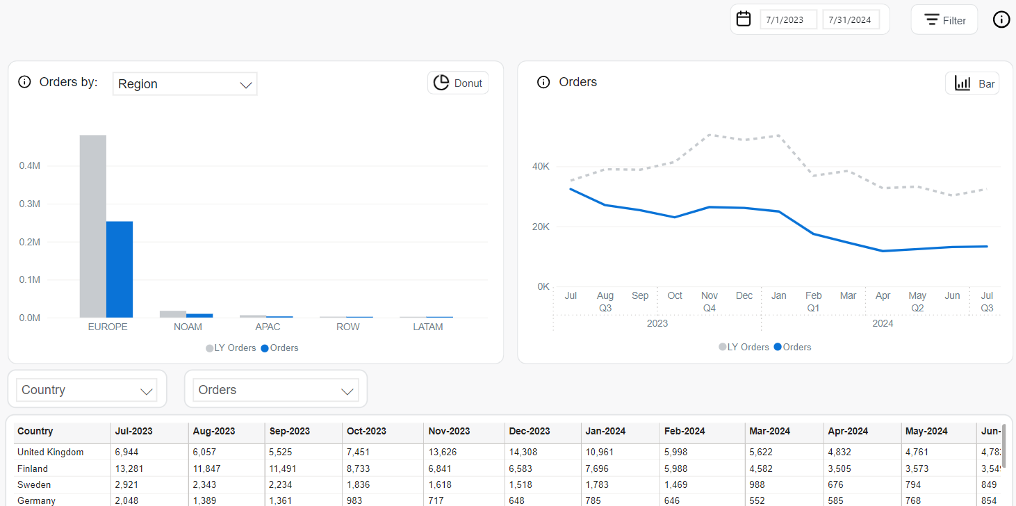
The Orders by chart allows users to analyze order volume across key business dimensions. The chart can be toggled between donut and bar views and filtered by attributes such as Region, Payment Type, Client, Product, or Country.
- Donut Chart: Emphasizes the proportional contribution of each segment to total orders. The center shows the total number of orders and year-over-year (YOY) change percentage with an indicator arrow.
- Bar Chart: Displays absolute order counts per segment and compares current versus prior year’s figures (LY Orders).
These formats provide a visual understanding of geographic or categorical order distribution and growth patterns.
The Orders chart shows order volume trends over time and is available in line and bar formats.
- Line Chart: Displays monthly fluctuations.
- Solid blue line: Number of orders in the current period.
- Dashed gray line: Number of orders from the same month last year.
- Bar Chart: Aggregates order volume by quarter.
- Blue bars: Orders in the current quarter.
- Gray bars: Orders in the same quarter of the previous year.
This view supports identifying seasonal trends and year-over-year performance changes.
The Orders table provides granular visibility into monthly order counts by country or other selected dimensions.
- Dimension Selector: Filters data by Client, Product, Country, Payment Type, Interval, and more.
- Metric Selector: Allows toggling between:
- Orders: Default total order count.
- MoM: Month-over-month change in orders.
- YOY: Year-over-year growth.
- % of Total: Share of each entry relative to the total.
- Top Filter: Highlights top-performing entries within the selected dimension.
This format enables detailed monitoring of order activity by market or customer group.
Sessions
Sessions track the number of user interactions with Cleverbridge's digital properties, helping assess customer engagement over time. The sessions metric can be broken down by various dimensions to reveal traffic patterns, regional differences, and product-level performance.
The following tools are used to analyze Sessions data:
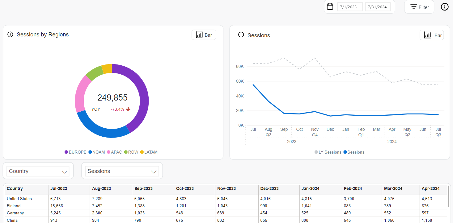
The Sessions by chart provides a flexible overview of user engagement, visualized across different dimensions. This chart offers a donut and a bar chart, each with distinct use cases:
-
Donut Chart (by Region only): Displays the total number of sessions and year-over-year (YOY) percentage change.
Each region is represented as a segment of the donut, illustrating its proportional contribution to overall traffic.
The center highlights:
- Total sessions during the selected timeframe.
- YOY change with directional arrows indicating increase or decline.
-
Bar Chart (configurable dimension): Visualizes absolute session counts by selected business dimensions. Supported filters include Client, Product, Product List, Payment Type, Payment SubType, Region, Country, and MVT.
- Blue bars: Sessions during the current period.
- Gray bars: LY Sessions from the same time last year.
This dual-chart setup enables comparative traffic analysis either by region (donut) or by selected category (bar).
The Sessions chart shows traffic trends over time in two display formats:
- Line Chart (monthly view):
- Solid blue line: Current period’s monthly sessions.
- Dashed gray line: Last year’s sessions for the same months.
- Bar Chart (quarterly view):
- Blue bars: Sessions for each quarter of the current year.
- Gray bars: LY Sessions for comparison.
These time-series views support seasonality analysis and long-term trend comparisons.
The Sessions table provides a detailed, customizable view of engagement metrics over time, with filtering and sorting capabilities:
- Dimension Selector: Filter by attributes like Country, Client, Product, Product List, Region, Payment Type, an others.
- Metric Selector: Choose from key performance indicators:
- Sessions: Total number of user sessions for the selected entity and time period.
- MoM: Month-over-month percentage change in sessions.
- YOY: Year-over-year growth compared to the same period in the previous year.
- % of Total: Share of each row relative to the total number of sessions.
- Top Filter: Highlight top-performing items within the selected dimension.
Conversion Rate
Conversion Rate is the percentage of checkout sessions that result in successfully completed initial orders (including non-recurring ones). Fraudulent transactions are excluded from the calculation, while refunds are included, since the metric is captured before refund processing occurs. This KPI helps evaluate the effectiveness of the checkout process across various business segments.
The following tools are used to analyze Conversion Rate performance:
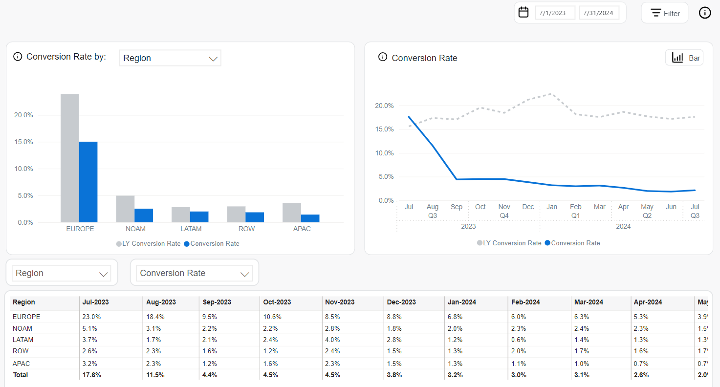
The Conversion Rate by chart offers an adaptable view of conversion success across selectable business dimensions. It includes a single bar chart format, and users can switch between dimensions such as Client, Product, Product List, Payment Type, Payment SubType, Region, Country, and MVT.
- Bar Chart (configurable dimension):
- Blue bars: Conversion Rate during the selected period.
- Gray bars: LY (Last Year) Conversion Rate for the same category.
This view highlights which segments are converting most effectively and how current performance compares to the previous year.
The Conversion Rate chart illustrates how conversion efficiency evolves over time. It supports two visual styles—monthly line chart and quarterly bar chart:
-
Line Chart (monthly view):
- Solid blue line: Conversion Rate per month in the current year.
- Dashed gray line: LY Conversion Rate for comparison.
-
Bar Chart (quarterly view):
- Blue bars: Quarterly Conversion Rate for the current year.
- Gray bars: Conversion Rate from the same quarters last year.
The Conversion Rate Table provides a detailed breakdown of conversion performance by time and business dimension. Users can tailor the analysis through interactive filters:
- Dimension Selector: Filter results by attributes such as Region, Country, Product, Product List, Payment Type, and others.
- Metric Selector: Enables switching between key conversion indicators:
- Conversion Rate: The percentage of sessions that resulted in completed orders.
- MoM: Month-over-month percentage change in Conversion Rate.
- YOY: Year-over-year change from the same period last year.
- Top Filter: Focus on top-performing entries based on the selected metric and dimension.
This table helps identify where conversion improvements or declines are occurring, and supports comparative analysis over time and across segments.
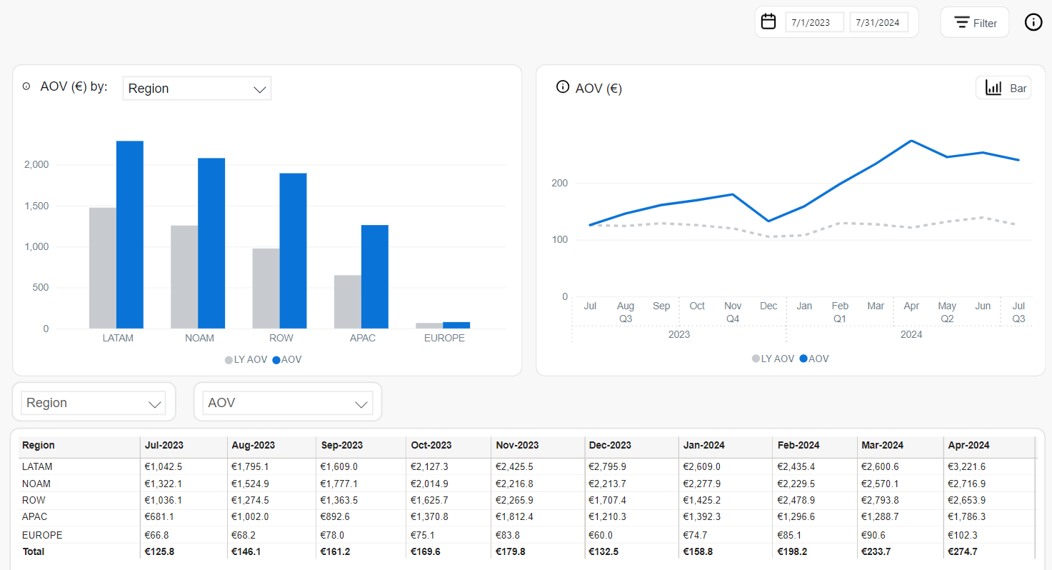
AOV
Average Order Value (AOV) represents the mean revenue generated per completed order.
It is calculated as Net Revenue divided by the number of orders. AOV serves as a critical measure of purchasing behavior, offering insight into the value of transactions over time and across segments.
The following tools are used to analyze AOV data:
The AOV by chart provides a breakdown of average order value across configurable business dimensions. It is a bar chart that supports multiple selectable dimensions including Client, Product, Product List, Recurrence, Renewal Period, Interval, Payment Type, Payment SubType, Region, and Country.
- Blue bars: AOV during the current period.
- Gray bars: LY AOV (Last Year) for the same dimension.
The AOV chart shows trends in average order value over time. It supports two visual formats:
-
Line Chart (monthly view):
- Solid blue line: Current monthly AOV.
- Dashed gray line: LY AOV from the same month last year.
-
Bar Chart (quarterly view):
- Blue bars: AOV per quarter in the current year.
- Gray bars: AOV for the same quarters in the previous year.
The AOV Table presents detailed, time-based AOV data broken down by business dimensions. It offers flexible filtering and metric customization:
- Dimension Selector: Filter AOV by Client, Product, Product List, Region, Country, Payment Type, Interval, and more.
- Metric Selector: Enables switching between:
- AOV: Average order value for the selected entity and period.
- MoM: Month-over-month change in AOV.
- YOY: Year-over-year change from the same period last year.
- Top Filter: Display only the top-performing entries in the selected dimension.
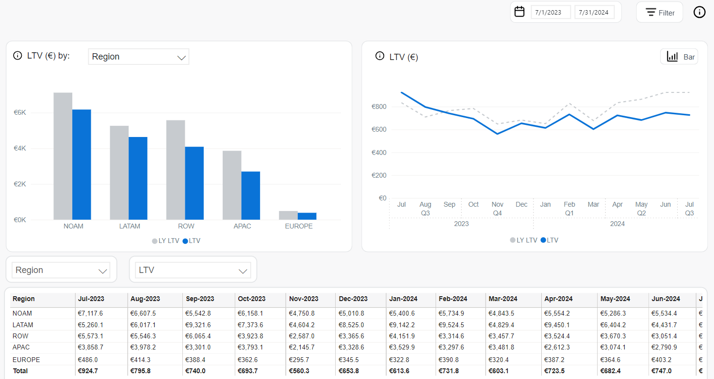
LTV
Customer Lifetime Value (LTV) estimates the expected total revenue an average customer will generate for your business over their entire lifetime as a paying customer.
LTV is calculated by dividing the average revenue per user (ARPU) by the user churn rate. LTV = ARPU / User Churn Rate, where:
- ARPU: Average Revenue Per User over a defined period.
- User Churn Rate = Cancelled Subscribers / (Active + Cancelled Subscribers) × 100%.
For a selected company, the ARPU is $11.64, and the average churn rate is 3.1%. Using the formula, the LTV is calculated as follows: LTV = 11.64 / 0.031 = 375.48. This means that the LTV for this company's average customer is approximately $375.48.
This metric helps businesses assess the long-term value of customer relationships and guides strategic decisions around acquisition cost, retention, and monetization.
The following tools are available to analyze the LTV values:
The LTV by chart visualizes LTV across various business dimensions using a bar chart. Users can filter the breakdown by attributes such as Client, Product, Product List, Renewal Period, Payment Type, Payment SubType, Region, Country, and B2B/B2C.
- Bar Chart (configurable dimension):
- Blue bars: LTV during the selected period.
- Gray bars: LY LTV (Last Year) for the same segment.
This chart allows for comparative lifetime value analysis across different customer or transactional segments.
The LTV chart provides a time-based view of customer value evolution, available in both line and bar chart formats:
-
Line Chart (monthly view):
- Solid blue line: Current LTV per month.
- Dashed gray line: LY LTV from the same months last year.
-
Bar Chart (quarterly view):
- Blue bars: LTV by quarter in the current year.
- Gray bars: LTV for the corresponding quarters in the previous year.
The LTV Table displays detailed lifetime value metrics across time and dimensions. It offers interactive filters to support targeted business analysis.
- Dimension Selector: Filter by Client, Region, Product, Payment Type, Renewal Period, Country, or B2B/B2C.
- Metric Selector: Enables switching between available metrics:
- LTV: Customer lifetime value for the selected time and segment.
- MoM: Month-over-month change in LTV.
- YOY: Year-over-year change in LTV.
- Top Filter: Display only top-performing segments based on the selected criteria.
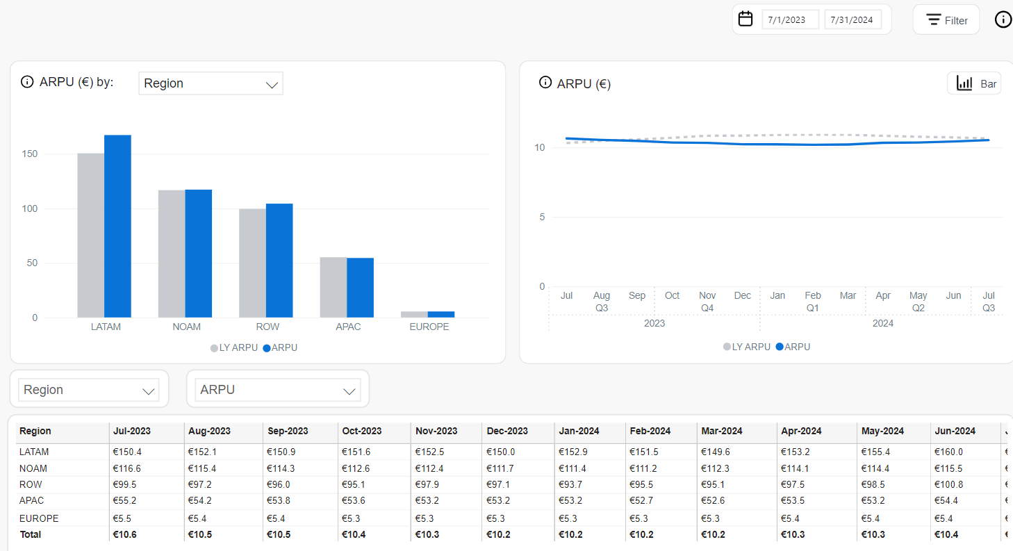
ARPU
Average Revenue per User (ARPU) represents the average monthly revenue generated per active subscriber. It is a foundational metric in recurring revenue models.
It is calculated as: ARPU = MRR / Active Subscribers.
This measure helps assess customer monetization efficiency and revenue scalability across segments and timeframes. The following tools help analyzing it:
The ARPU by chart breaks down average revenue per user across selectable business dimensions in a bar chart format. Available dimensions include Client, Product, Product List, Renewal Period, Interval, Payment Type, Payment SubType, Region, and Country.
- Blue bars: ARPU for the current period.
- Gray bars: LY ARPU (Last Year) for the same dimension.
This view enables direct comparison of revenue efficiency per user across different market segments and operational attributes.
The ARPU chart visualizes revenue-per-user trends over time in two different chart types:
-
Line Chart (monthly view):
- Solid blue line: Current ARPU values per month.
- Dashed gray line: LY ARPU from the same months in the prior year.
-
Bar Chart (quarterly view):
- Blue bars: ARPU for each quarter of the current year.
- Gray bars: ARPU for the same quarters in the previous year.
The ARPU Table provides detailed reporting on average revenue per user by time period and selected dimensions. It includes filtering and sorting functionality for targeted analysis.
- Dimension Selector: Filter by Region, Client, Product, Payment Type, Interval, Country, and more.
- Metric Selector: Choose between:
- ARPU: Revenue per active user for the selected timeframe.
- MoM: Month-over-month change in ARPU.
- YOY: Year-over-year difference from the same period last year.
- Top Filter: Focus on top-performing segments within the selected dimension.
This view enables granular tracking of monetization trends and highlights differences in ARPU across customer groups or markets.
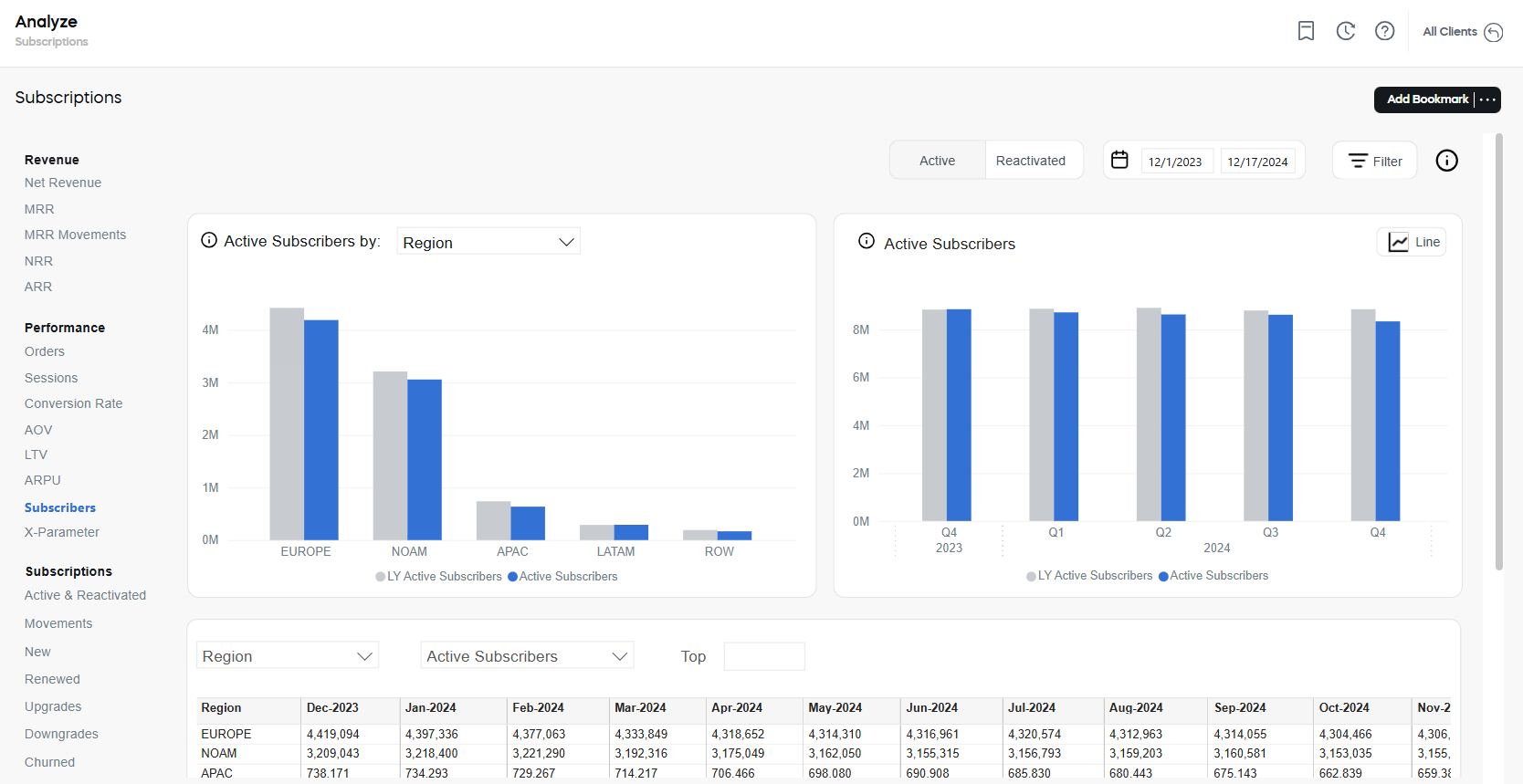
Subscribers
The Subscribers metric represents the number of subscription-based customers at a given point in time. Each subscriber is uniquely identified using their email addresses.
Subscriber analytics covers active and reactivated subscribers.
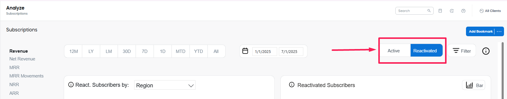
Active Subscribers
Active Subscribers are unique subscribers holding at least one paid subscription item. If a subscriber has multiple subscription items, they will still only be counted as one subscriber.
Reactivated Subscribers
Reactivated Subscribers are unique subscribers who have returned after a period of inactivity. The following criteria ensure accurate identification of reactivated subscribers within the relevant timeframe:
- A subscriber is considered reactivated if they re-subscribe more than seven days but not more than 3 month after canceling their subscription.
- If a subscriber reactivates their subscription after a period exceeding three months, they are treated as a new subscriber.
- For subscribers with multiple subscriptions, they are only classified as reactivated if all subscriptions were canceled and at least one is renewed within the specified period. both subscribers that are currently active or were reactivated during the selected reporting period.
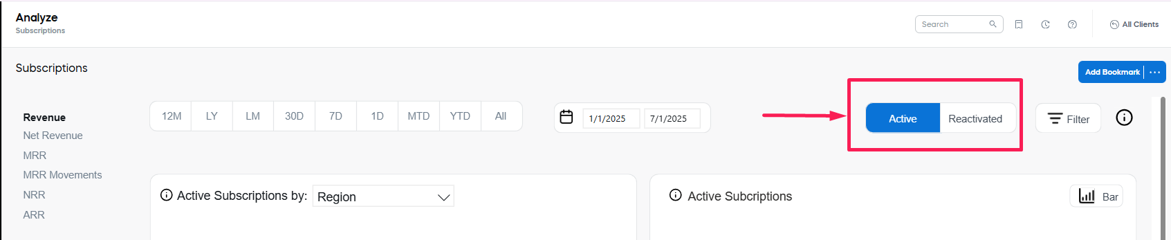
When analyzing Subscriber-related values, you can switch between the Active and Reactivated values, using the tab switcher in the top-right corner of the page (to the left of the reporting period settings)
 .
.
The following tools are available for the analysis of both Active and Reactivated Subscribers:
The Active/Reactivated Subscribers by chart presents the number of active/reactivated subscribers broken down by selectable business dimensions including Client, Product, Product List, Renewal Period, Interval, Payment Type, Payment SubType, Region, and Country.
- Blue bars: Active/Reactivated Subscribers in the current period.
- Gray bars: LY Active/Reactivated Subscribers for the same segment.
This chart is ideal for comparing subscriber distribution and identifying strong or weak performing segments.
The Active/Reactivated Subscribers chart shows how the total number of active/reactivated subscribers changes over time. It supports two display formats:
- Line Chart (monthly view):
- Solid blue line: Active/Reactivated subscribers per month in the current year.
- Dashed gray line: LY Active/Reactivated Subscribers from the same months in the previous year.
- Bar Chart (quarterly view):
- Blue bars: Quarterly active/reactivated subscribers in the current year.
- Gray bars: Quarterly values from the previous year.
The Active/Reactivated Subscribers table presents detailed subscriber counts over time, segmented by business dimensions. It includes filtering and metric customization for deeper insights.
- Dimension Selector: Filter by Region, Country, Product, Client, Payment Type, and more.
- Metric Selector: Enables switching between:
- Active Subscribers: Total active/reactivated subscriptions per selected category and timeframe.
- MoM: Month-over-month change in subscriber count.
- YOY: Year-over-year difference compared to the same period last year.
- Top Filter: Focus on top categories contributing the most active subscribers.
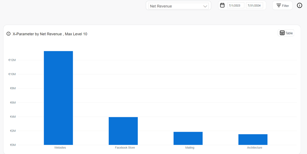
X-Parameter
x-Parameters are variables appended to order processing URLs. They can be used to:
- Capture valuable data during the order process—such as revenue sources, customer attributes, affiliate identifiers, and partner details.
- Categorize and track orders efficiently for accurate reporting and analytics.
These parameters play a crucial role in measuring the impact and effectiveness of your marketing and promotional efforts.
- For more information on how x-Parameters are used to pass information through the checkout process to track revenue, see Incentivize customers and Track orders and monitor revenue.
- For more information on x-Parameters, see Set up x-Parameters.
You can use the following tools to analyze x-Parameter values:
The bar chart shows data on the five chosen x-Parameters. You can drill down to see the following metrics for each of the x-Parameters:
- Net Revenue: The total subscription-based revenue collected through Cleverbridge, excluding taxes and adjusted for discounts and shipping. It includes affiliate commissions and fees, and is calculated based on the exchange rate at the time of transaction.
- New Subscription Items: Revenue attributed to newly initiated subscription items in the selected period, reflecting acquisition-driven growth.
- Renewed Subscription Items: Revenue generated from existing subscription items that were successfully renewed, contributing to retention and recurring income.
- Churned Subscription Items: Loss of revenue resulting from subscription items that were not renewed or were canceled, representing customer attrition.
- Orders: The number of completed subscription purchases in a given timeframe. These include initial sign-ups and renewals, excluding fraudulent or fully refunded transactions.
- AOV: The average revenue per completed subscription order. It is calculated as Net Revenue divided by the total number of orders, indicating the average transaction value.
- Renewal Rate: The percentage of expiring subscriptions that were successfully renewed within the reporting period.
- Refund Rate: The proportion of orders that were refunded, either partially or in full, relative to the total number of completed orders.
- Chargeback Rate: The percentage of transactions disputed and reversed by customers via their payment provider.
- Conversion Rate: The percentage of checkout sessions that resulted in successful order completion.
The Table tab displays the entire data used to calculate the metrics of the x-Parameter bar charts including the x-Parameter classes and their sub levels.
To use x-Parameter metrics and x-Parameter filters, you first need to create the x-Parameter categories and subcategories in the system. Otherwise, no data is populated.
Subscriptions
The Subscriptions section delivers deep visibility into the lifecycle and health of recurring billing agreements between customers and your business. It provides interactive tools to monitor how subscription volumes evolve, how customers engage over time, and where growth, retention, or churn trends emerge. Each subsection focuses on a specific aspect of subscription dynamics, enabling granular analysis by customer segments, products, billing intervals, and regions.
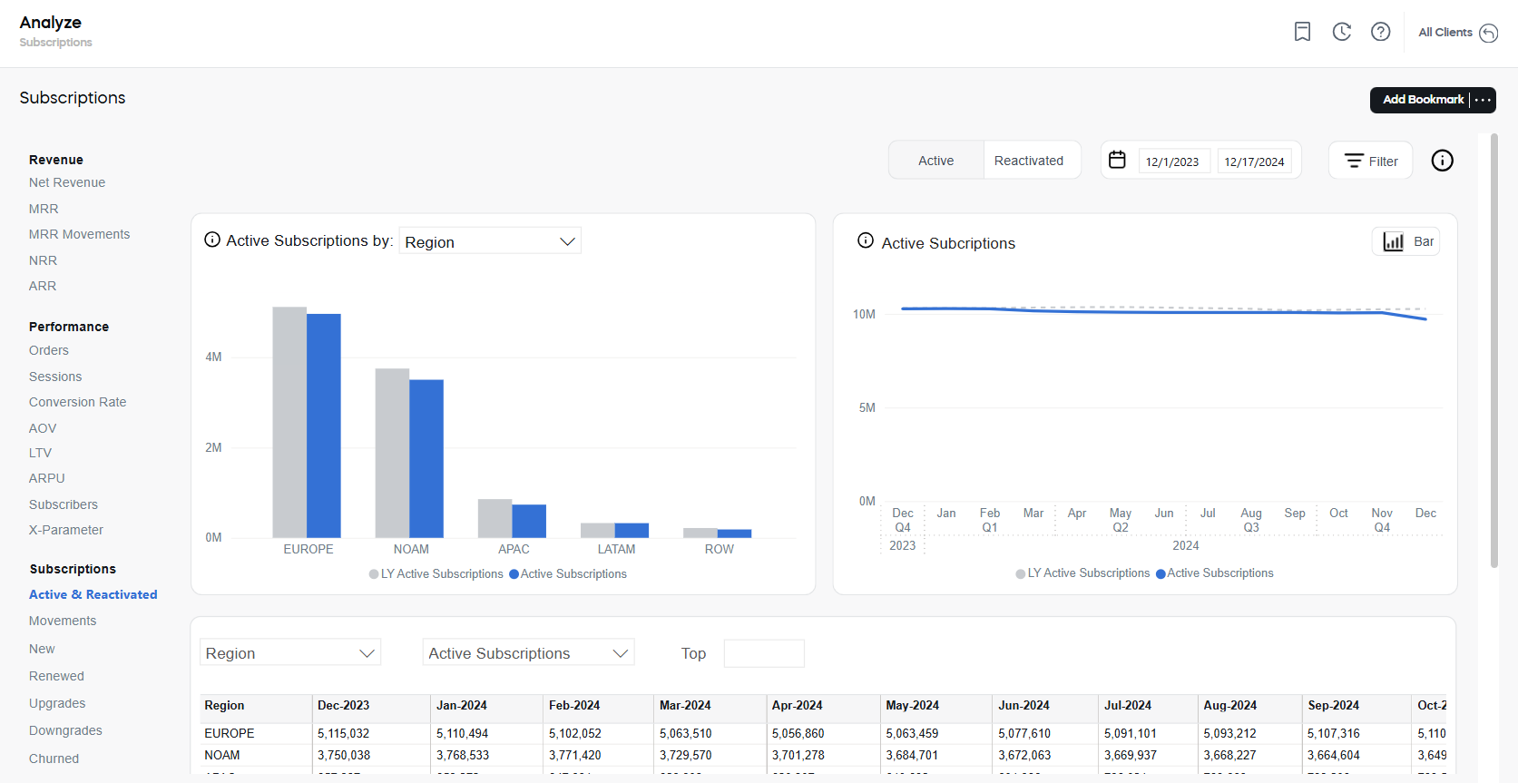
Active and Reactivated subscriptions
A Subscription is a recurring billing agreement between a customer and a business for a specific subscription item. A Subscription item is a recurring product that is billed at regular intervals, such as monthly or yearly.
The Active and Reactivated dashboard provides insights into the total number of paid subscription items that are either currently active or were reactivated during the selected reporting period.
Active Subscriptions
Active Subscriptions reflect the number of active paid subscriptions at the end of the reporting period.
Reactivated Subscriptions
Reactivated Subscriptions reflect the number of paid subscriptions that were reactivated after a period of inactivity. A subscription is considered reactivated if the customer resubscribes more than seven days but not more than three months after canceling their subscription. If the subscription is reactivated after a period exceeding three months, it is treated as a new subscription.
When analyzing Subscription-related values, you can switch between the Active and Reactivated values, using the tab switcher in the top-right corner of the page (to the left of the reporting period settings)
 .
.
The following tools are available for the analysis of both Active and Reactivated Subscriptions within the selected period and similar period last year:
The Active/Reactivated Subscriptions by chart displays the number of currently active/reactivated paid subscription items across selected business dimensions. It helps identify where the subscriptions are concentrated and how they compare year-over-year.
This chart is presented as a bar chart and supports filtering by multiple dimensions, such as Client, Product, Product List, Renewal Period, Interval, Payment Type, Region, and Country.
- Blue bars represents the total number of active subscriptions for the selected dimension during the reporting period.
- Gray bars show values from the same period last year (LY Active/Reactivated Subscriptions) for direct year-over-year comparison.
The Active/Reactivated Subscriptions chart shows how the total number of active/reactivated subscription items changes over time. It helps identify trends in customer retention and subscription volume growth.
This visualization is available in two formats:
-
Line Chart (monthly view):
- Solid blue line: Active/Reactivated subscriptions for each month in the current year.
- Dashed gray line: Active/Reactivated subscriptions from the same months last year.
-
Bar Chart (quarterly view):
- Blue bars: Active/Reactivated subscriptions for each quarter in the current year.
- Gray bars: Active/Reactivated subscriptions from the corresponding quarters last year.
The Active/Reactivated Subscriptions table provides a detailed, data-rich view of the subscription items across selected business dimensions and time periods. The following controls are available:
- Dimension Selector: Filter by attributes such as Client, Product, Renewal Period, Interval, Region, and others.
- Metric Selector: Choose between performance metrics to view:
- Active Subscriptions: Number of the subscriptions in the selected period.
- MoM: Month-over-month change in the subscriptions.
- YOY: Year-over-year change compared to the same period last year.
- Top Filter: Limit results to top-performing entries within the selected dimension.
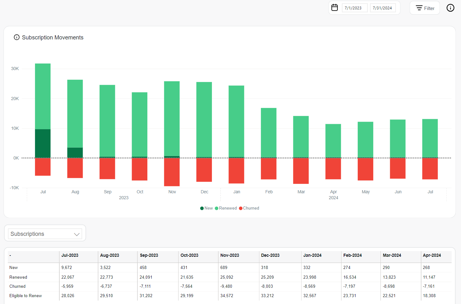
Movements
Movements are changes in the state of a subscription item during a given reporting period. The following states can be tracked:
- New: Active, paid subscription items with the first payment having occurred in a given period.
- Renewed: Subscription items, which were paid to extend the access to a product or a service beyond the initial purchase. This value corresponds to the count of distinct subscription items where subscription interval > 0.
- Churned: Subscription items that have not been renewed in a given period of time. In other words, it is a scheduled renewal that did not occur on or before the expected payment date, which results in the loss of an existing subscription item.
- Returned: Subscription items that were refunded after activation (for example, due to cancellation, chargeback, or fraud).
- Eligible to Renew: The total number of subscriptions up for renewal during the reporting period.
Tracking the Movements allows you to monitor the health and trajectory of your subscription base over time. By analyzing how many subscriptions are added, renewed, lost, or refunded, you gain a clear view of the net growth or decline in your active subscription volume.
The following tools are available for the analysis:
The Subscription Movements chart displays a monthly stacked bar graph that visually represents the net change in subscriptions. Each bar is segmented into available subscriptions states as described above.
Positive values (new and renewed) are shown above the axis, while churned subscriptions appear below to emphasize their negative impact.
The Subscription Movements table presents the numerical values for each movement type over time. This includes monthly totals and a running total for the selected period for each of the subscription states.
The table also supports metric switching using the selector:
- Subscriptions: Absolute values.
- MoM: Month-over-month change.
- YOY: Year-over-year comparison.
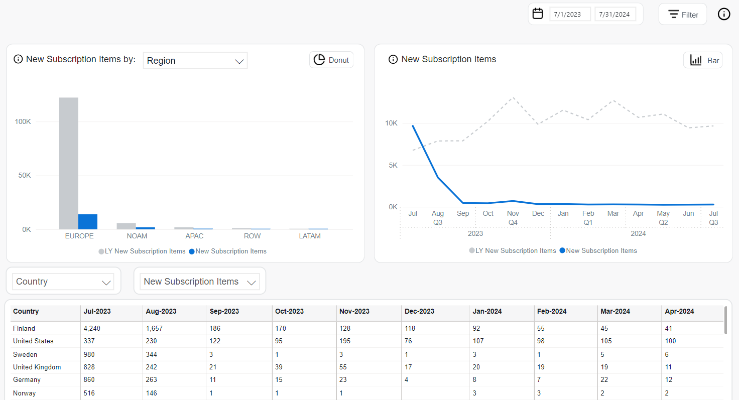
New
New Subscription Items represent paid subscription items that were activated for the first time during the selected reporting period. This metric captures newly acquired recurring revenue and is a key indicator of growth through customer acquisition.
Returned or refunded items (such as chargebacks or cancellations) are excluded from this metric to reflect only valid, billable activations.
Tracking the New metric allows you to monitor acquisition trends, evaluate the success of marketing and sales initiatives, and compare performance across different customer segments or business categories.
The following tools are available for the analysis:
The New Subscription Items by chart provides a segmented view of new subscription volume by selected business dimensions. It includes two display types:
-
Donut Chart: Highlights the proportional distribution of new subscription items across categories.
- For the donut chart the categories include:
- Client
- Region
- Type or customer (B2B or B2C)
- Renewal Period.
- The center of the donut displays the total number of new subscriptions and the year-over-year (YOY) change with an arrow indicator.
- For the donut chart the categories include:
-
Bar Chart: Displays absolute values per dimension (including Region, Client, Payment Type and many more), comparing the current period against the same period last year.
- Blue bars represent current totals.
- Gray bars show LY (Last Year) values.
The New Subscription Items chart shows time-based trends in new subscription activations. This tool supports both monthly and quarterly views:
-
Line Chart (monthly trend):
- Solid blue line: Current year's monthly new subscriptions.
- Dashed gray line: Last year's values for comparison.
-
Bar Chart (quarterly totals):
- Blue bars: New subscriptions by quarter for the current year.
- Gray bars: New subscriptions from the same quarter last year.
The New Subscription Items table provides a detailed numerical view of new subscriptions across time and business segments. Users can filter the table by:
- Dimension Selector: Client, Product, Country, Region, Payment Type, Interval, and more.
- Metric Selector: Includes the following options:
- New Subscription Items: Default absolute values.
- MoM: Month-over-month change.
- YOY: Year-over-year change.
- % of Total: Share of total new subscriptions per row.
- Top Filter: Focuses the view on the highest-performing segments.
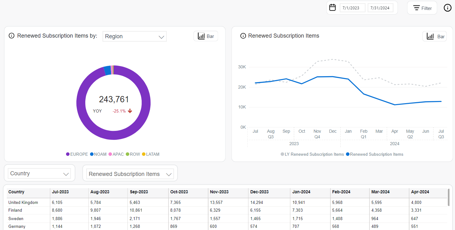
Renewed
Renewed Subscription Items represent recurring subscription items that have been successfully extended through payment beyond their original purchase term. This metric reflects returning revenue and is a direct indicator of customer retention and the value of long-term subscriptions.
Returned or refunded renewals are excluded from this metric to ensure accuracy in assessing sustained engagement.
Tracking the Renewed metric allows you to monitor retention behavior, evaluate subscription lifecycle performance, and identify regions, products, or segments with strong renewal rates.
The following tools are available for the analysis:
The Renewed Subscription Items by chart provides a segmented view of renewed subscription volumes across different business dimensions. It supports two visual formats:
-
Donut Chart: Highlights the proportional distribution of renewed subscription items across categories.
- The available categories include:
- Client
- Region
- B2B / B2C
- Renewal Period
- Recurrence
- The center of the donut displays the total number of renewed subscription items and the year-over-year (YOY) percentage change, accompanied by an arrow indicator.
- The available categories include:
-
Bar Chart: Displays absolute counts of renewed subscription items by selected dimension (including Region, Client, Payment Type and many more).
- Blue bars represent current period values.
- Gray bars represent last year’s values.
The Renewed Subscription Items chart shows how renewal activity trends over time and supports two visual formats:
-
Line Chart (monthly view):
- Solid blue line: Renewed subscription items by month this year.
- Dashed gray line: Renewed subscription items from the same months last year.
-
Bar Chart (quarterly view):
- Blue bars: Renewed subscriptions per quarter in the current year.
- Gray bars: LY comparison.
The Renewed Subscription Items table presents detailed renewal data segmented by dimensions such as Country, Product, Region, and more.
Available controls include:
- Dimension Selector: Filter by attributes such as Country, Region, Client, or Product.
- Metric Selector:
- Renewed Subscription Items: Default absolute count.
- MoM: Month-over-month renewal change.
- YOY: Year-over-year comparison.
- % of Total: Share of each row relative to total renewals.
- Top Filter: Limit view to top-performing renewal sources.
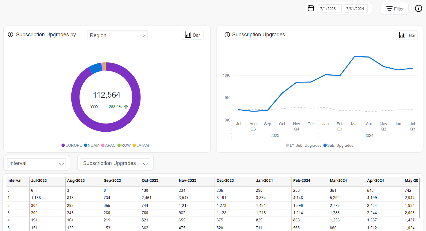
Upgrades
Subscription Upgrades show the total number of subscriptions where customers switched to a more expensive paid plan. This reflects expansion revenue through plan changes or quantity increases.
The system identifies upgrades by comparing subscription prices between consecutive billing periods:
- The customer switched to a different product (
PRODUCT_IDchanged) with a higher plan price (cross-sell). - The customer increased the quantity of the same product (
SI_QUANTITYchanged), resulting in a higher total price (upsell).
Tracking the Upgrades metric helps assess account expansion, product adoption, and revenue growth driven by plan changes or usage increases.
The following tools are available for the analysis:
The Subscription Upgrades by chart allows you to break down upgrades by various business dimensions. Two views are available:
-
Donut Chart: Shows proportional contribution of each segment.
- The available categories include:
- Client
- Region
- B2B / B2C
- Renewal Period
- The center of the donut displays the total number of subscription upgrades and the year-over-year (YOY) growth.
- The available categories include:
-
Bar Chart:Displays absolute counts of renewed subscription items by selected dimension (including Region, Client, Payment Type and many more).
- Blue bars represent current period values.
- Gray bars represent last year’s values.
The Subscription Upgrades chart shows the evolution of upgrade activity over time, using two visual formats:
-
Line Chart (monthly view):
- Blue line: Upgrade volume this year.
- Gray dashed line: Upgrade volume from the same period last year.
-
Bar Chart (quarterly view):
- Blue bars: Upgrade totals by quarter for the current year.
- Gray bars: Last year’s values.
The Subscription Upgrades table presents detailed upgrade figures across selected time intervals and dimensions. It supports:
- Dimension Selector: Filter by Interval, Client, Product, Region, Renewal Period, and others.
- Metric Selector:
- Subscription Upgrades: Default absolute values.
- MoM: Month-over-month change.
- YOY: Year-over-year growth.
- % of Total: Share of each row in total upgrade volume.
- Top Filter: Focuses on top-performing upgrade segments.
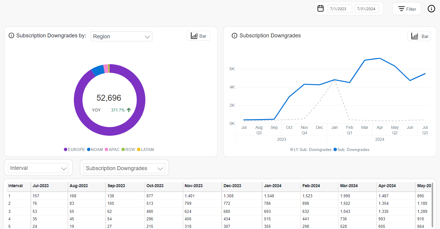
Downgrades
Subscription Downgrades show the total number of subscriptions where customers switched to a lower-priced paid plan. This reflects contraction in revenue due to plan changes or quantity reductions.
The system identifies downgrades by comparing subscription prices between consecutive billing periods:
- The customer switched to a different product (
PRODUCT_IDchanged) with a lower plan price (cross-downgrade). - The customer reduced the quantity of the same product (
SI_QUANTITYchanged), resulting in a lower total price (usage-based downgrade).
Tracking the Downgrades metric helps assess contraction trends, customer cost sensitivity, and the impact of pricing or product packaging strategies.
The following tools are available for the analysis:
The Subscription Downgrades by chart allows you to break down downgrades by various business dimensions. Two views are available:
-
Donut Chart: Shows proportional contribution of each segment.
- Available categories include:
- Client
- Region
- B2B / B2C
- Renewal Period
- The center of the donut displays the total downgrades and the year-over-year (YOY) growth.
- Available categories include:
-
Bar Chart: Displays absolute counts of renewed subscription items by selected dimension (including Region, Client, Payment Type and many more).
- Blue bars represent current period values.
- Gray bars represent last year’s values.
The Subscription Downgrades chart shows the evolution of downgrade activity over time, using two visual formats:
-
Line Chart (monthly view):
- Blue line: Downgrade volume this year.
- Gray dashed line: Downgrade volume from the same period last year.
-
Bar Chart (quarterly view):
- Blue bars: Downgrade totals by quarter for the current year.
- Gray bars: Last year’s values.
The Subscription Downgrades table presents detailed downgrade figures across selected time intervals and dimensions. It supports:
- Dimension Selector: Filter by Interval, Client, Product, Region, Renewal Period, and others.
- Metric Selector:
- Subscription Downgrades: Default absolute values.
- MoM: Month-over-month change.
- YOY: Year-over-year growth.
- % of Total: Share of each row in total downgrade volume.
- Top Filter: Focuses on top-performing downgrade segments.
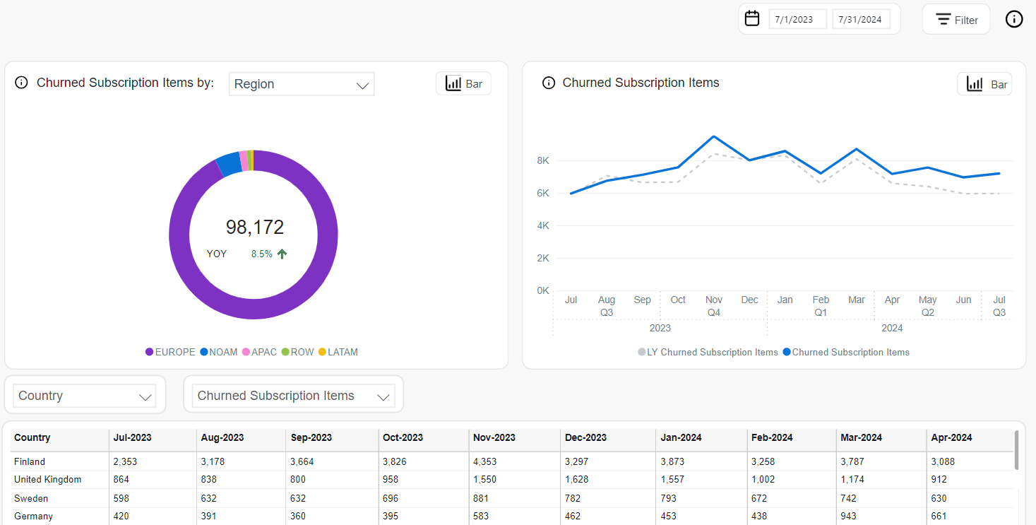
Churned
Churned Subscription Items represent paid subscription items that were expected to renew but did not. A churn event occurs when a scheduled renewal payment fails to materialize by the expected renewal date, indicating a loss of active subscription.
Refunded or returned renewals are excluded from this metric to preserve accuracy in tracking true customer loss.
Tracking the Churned metric provides insight into subscription attrition and helps identify regions, products, or customer segments experiencing high disengagement. It is essential for evaluating retention strategy effectiveness and forecasting subscription base stability.
The following tools are available for the analysis:
The Churned Subscription Items by chart offers a segmented analysis of churned subscriptions across various business dimensions. Two visualization modes are supported:
-
Donut Chart: Displays the proportional distribution of churned items across categories.
- The full set of donut chart dimensions includes:
- Client
- Region
- B2B / B2C
- Renewal Period
- Recurrence
- The center of the chart shows the total number of churned subscription items and the year-over-year (YOY) percentage change with directional indicator.
- The full set of donut chart dimensions includes:
-
Bar Chart: Compares absolute churn counts per selected dimension (including Region, Client, Payment Type and many more), showing:
- Blue bars for the current period.
- Gray bars for the same period last year.
The Churned Subscription Items chart visualizes churn dynamics over time. It supports:
-
Line Chart (monthly trend):
- Solid blue line: Monthly churned subscriptions this year.
- Dashed gray line: Churn for the same months in the prior year.
-
Bar Chart (quarterly totals):
- Blue bars: Churned items by quarter this year.
- Gray bars: Last year’s values.
The Churned Subscription Items table provides detailed figures segmented by time and business dimensions. You can interact with it via:
- Dimension Selector: Includes Country, Region, Client, Product, Payment Type, Interval, and more.
- Metric Selector: Choose among:
- Churned Subscription Items (default absolute value)
- MoM: Month-over-month change
- YOY: Year-over-year change
- % of Total: Relative contribution of each row
- Top Filter: Focus on the highest churn contributors.
Retention
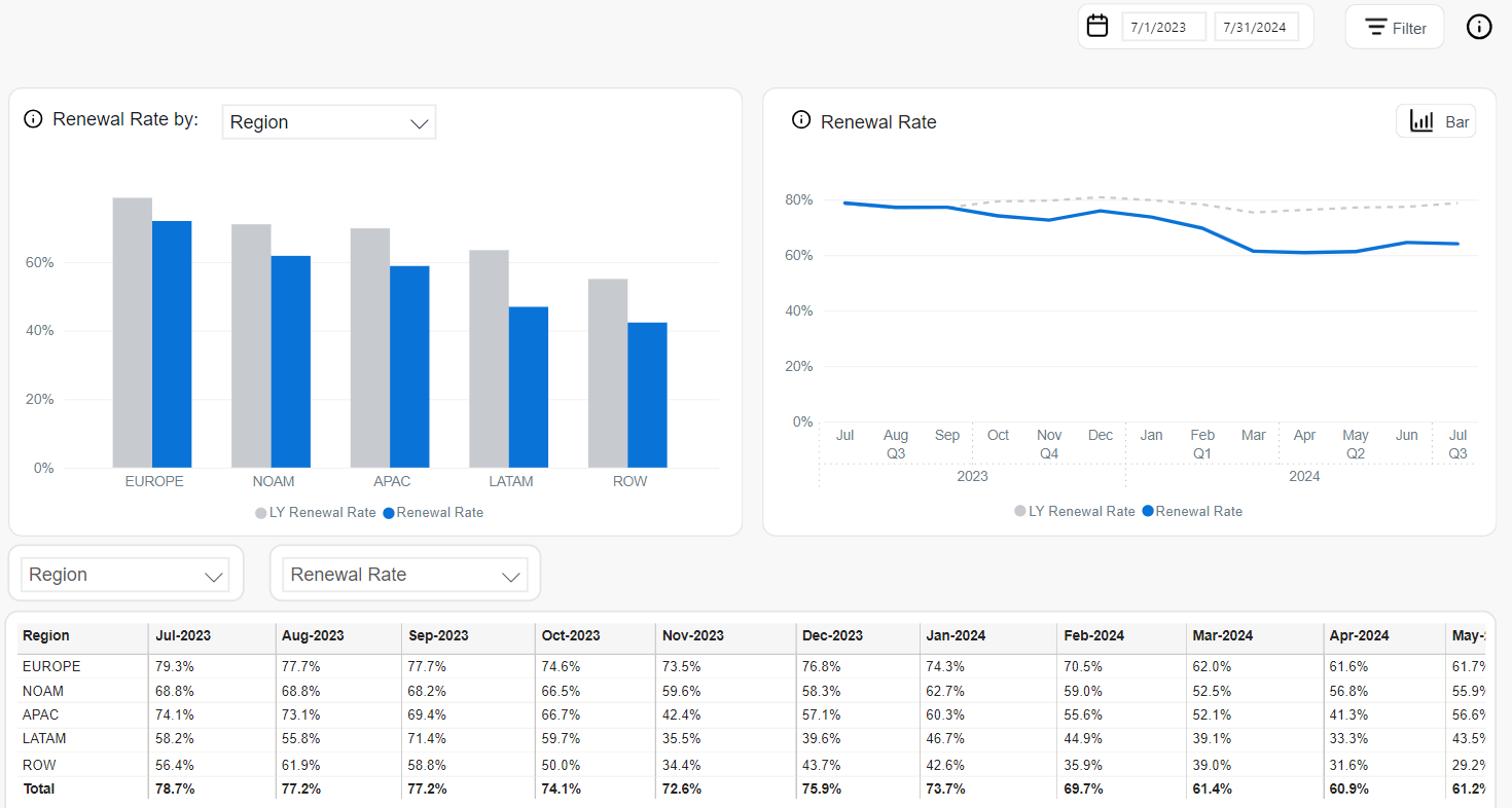
Renewal Rate
Renewal Rate represents the percentage of eligible subscription items that were successfully renewed (excluding returns or refunds) during a given reporting period. It serves as a core retention metric, helping assess how well your subscription model is maintaining existing customers.
To ensure that the value reflects truly successful retained customers:
- Returned items are not counted as renewed—only successfully retained subscriptions are included.
- Trial subscriptions are not included.
- Grace period is considered.
Returned subscription items—including those refunded or charged back—are excluded from this metric. Only active, paid, and non-returned renewals are considered successful.
The following analytics tools are available for analyzing Renewal Rate trends:
The Renewal Rate by chart presents renewal performance segmented by selectable business dimensions, including Region, Payment Type, Client, Product, or Interval. It is displayed in a bar chart format, showing:
- Blue bars: Renewal Rate for the selected segment during the current period.
- Gray bars: Renewal Rate from the same segment and period last year (LY Renewal Rate).
This visualization helps identify which segments retain customers effectively and where improvements may be needed.
The Renewal Rate chart provides a time-based view of renewal success, supporting both line and bar formats:
-
Line Chart (monthly view):
- Solid blue line: Current month’s Renewal Rate.
- Dashed gray line: Renewal Rate from the same month last year.
-
Bar Chart (quarterly view):
- Blue bars: Quarterly Renewal Rate for the current year.
- Gray bars: LY values for the same quarters.
This chart supports seasonality analysis and long-term retention trend comparisons.
The Renewal Rate table provides detailed figures segmented by time and business dimensions. It includes controls for customized analysis:
- Dimension Selector: Filter data by Client, Product, Region, Country, Renewal Period, and more.
- Metric Selector: Switch between:
- Renewal Rate: Percentage of successfully renewed subscription items.
- MoM: Month-over-month change.
- YOY: Year-over-year comparison.
- Top Filter: Focus on top-performing dimensions with the highest Renewal Rates.
This table helps uncover trends in customer retention and informs strategies to increase renewal success.
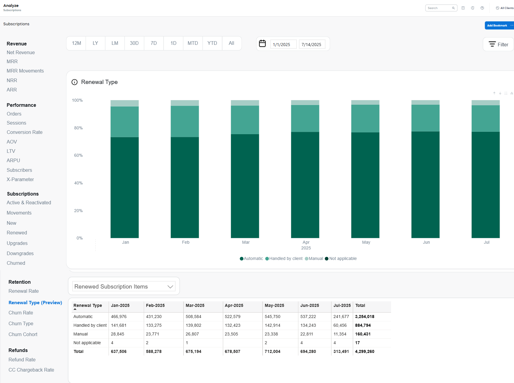
Renewal Type
Renewal Type is a characteristic of a renewal based on how a subscription was renewed on the Cleverbridge platform. It describes the method or channel through which a subscription's billing was extended after its original term expired.
The list of Renewal Types includes:
- Automatic: All automatic renewals and reinstated renewals, which are subscriptions that were reinstated before or after their renewal date.
This is the most common renewal type, as, by default, every subscription automatically renews unless the customer cancels it in advance.
Automatic renewals include Manual Payment Renewals, which is renewals completed through offline payment methods. This includes renewals where the initial attempt failed, but the customer completed the payment using a “Change Payment” link. - Manual: Renewals initiated directly by the customer using "Renew Now" functionality, either before or after the renewal date.
Such renewals are typical when Subscription Portal 2.0 is used.
Within manual renewals there is one process we want to point out Renewals triggered via API, which are renewals initiated using the API with the parametertriggerImmediateRenewal=True.This is especially relevant for clients on Subscription 1.0, where such API usage results in manual renewals being reflected in reporting. - Handled by Client: Renewals fully managed by the client through API integration.
- Not Applicable: Refers to subscription purchases that do not qualify as renewals (for example, alignments).
Upgrades are not treated as a renewal type. Instead, they retain the renewal type of the original subscription.
The following tools are available for Renewal Type analysis:
The Renewal Type chart shows the monthly distribution of renewal types as a stacked bar chart. Each bar represents 100% of all renewed subscription items in the given month, with color-coded segments indicating the share of each renewal type:
- Automatic: Dark green
- Handled by Client: Medium green
- Manual: Light green
- Not Applicable: Pale teal
This view supports trend analysis in how renewal methods shift over time, helping highlight increases in automation or changes in customer behavior.
The Renewal Type table presents absolute values of renewed subscription items, segmented by month and renewal type.
- Metric Selector: Choose between:
- Renewed Subscription Items: Total count per renewal type.
- MoM: Month-over-month change.
- YOY: Year-over-year change.
- % of Total: Share of each renewal type in total renewals.
- Filter Options: Users can limit the table view to specific time periods or top renewal categories.
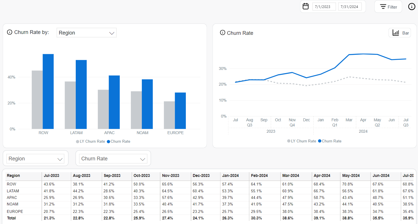
Churn Rate
Churn Rate represents the percentage of subscription items that were not renewed from among the items that were eligible to renew during the selected reporting period. It is a key performance indicator that reflects customer retention challenges and potential revenue loss.
Returned or refunded items are excluded from this calculation, as are trial subscriptions. Additionally, the grace period is respected, meaning delayed but successful renewals are not counted as churned.
Monitoring the Churn Rate helps identify trends in customer attrition and highlights at-risk segments, products, or geographies. This insight is valuable for developing proactive retention strategies and prioritizing interventions.
The following tools are available for analyzing Churn Rate:
The Churn Rate by chart provides a segmented comparison of churn rates across selected business dimensions. It is represented as a bar chart that displays current and prior year’s churn rates side by side for each category.
- Blue bars represent current period values.
- Gray bars indicate LY (Last Year) values.
The chart can be built for different dimensions, including specific Clients, Products, Intervals, Payment Types, Countries, and other.
The Churn Rate chart illustrates how churn performance evolves over time using two formats:
-
Line Chart (monthly view):
- Solid blue line: Monthly Churn Rate for the current year.
- Dashed gray line: Last year’s monthly Churn Rate.
-
Bar Chart (quarterly view):
- Blue bars: Quarterly Churn Rate for the current year.
- Gray bars: LY Churn Rate for comparison.
These time-based views help uncover seasonal churn patterns and long-term trends.
The Churn Rate table provides a detailed numeric breakdown of churn rates over time. You can filter and segment the data using:
- Dimension Selector: Country, Region, Product, Client, Payment Type, etc.
- Metric Selector:
- Churn Rate: Default percentage value.
- MoM: Month-over-month change.
- YOY: Year-over-year change.
- Top Filter: Allows focusing on the highest churn sources.
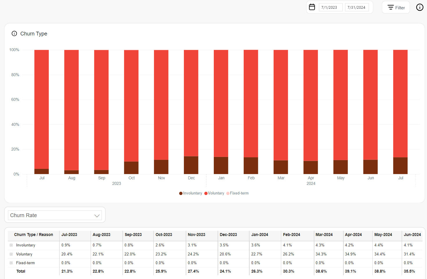
Churn Type
Churn Type categorizes the reasons behind subscription churn, offering visibility into customer attrition and helping businesses identify patterns in cancellations. This metric reflects churned subscription items based on their classification into one of four categories:
-
Voluntary Churn occurs when a subscriber purposefully cancels a subscription item. The reasons for voluntary churn are the following:
- Customer Cancellation: The customer opted out of renewing the subscription item before or during the renewal process.
- Manual Subscription Non-renewal: The customer did not give their consent to renew the subscription item after the grace period reached its end. For more information on subscription renewal types, see Subscription lifecycle events.
noteThe renewal type is independent of the payment method selected by the customer. If an item churns while being renewed manually and paid for by an offline payment method simultaneously, the registered churn reason for the item churn is manual subscription.
- Refund: The customer requested a refund right after the successful renewal process of the subscription.
- Chargeback: The customer didn’t recognize the transaction on their bank statement right after the successful renewal process of an automatic subscription. They requested reimbursement from their bank thereafter.
-
Involuntary Churn occurs when the renewal payment for a subscription item is not received by the renewal date for one of the following reasons:
-
Outdated Payment Information:
- Failed Account Connection
- Insufficient Funds
- Offline Payment: During the renewal process, the transaction using an offline payment method wasn't successfully processed.
noteThe manual subscription churn reason outranks offline payment. This means that if an item churns while being paid for by an offline payment and the subscription is renewed manually by the customer, the reason for the item churn is manual subscription and not offline payment.
-
-
Fixed-term Churn occurs when a subscription item has a hard-set expiration date. This means that the subscription item will automatically be canceled at the end of a contract period because of special circumstances like discontinuing a product or ceasing business altogether with an embargoed country. The reasons for fixed-term churn are the following:
- External Reason: The subscription item churns out due to external reasons such as export regulations and compliance, discontinued product, terminated client ID, or API call with flag to terminate.
- Limited Renewals: The subscription item churns out after a predetermined number of renewals.
- Bounced Mail: The subscription item churns out following an undelivered email to the customer and high risk of chargeback is suspected.
-
Churn handled by Client occurs when clients independently manage subscriptions, which is executed via API call by using the Deactivate Subscription Items endpoint.
noteThe churn data reflects subscription renewals that already occurred.
Understanding Churn Types enables more targeted retention efforts, informs product and payment strategies, and highlights areas for operational improvements.
The following analytics tools are available to assess Churn Type breakdown:
The Churn Type chart displays the proportion of churned subscription items by reason over time using a stacked bar format. Each bar represents 100% of the churned items in a given month, segmented by churn type:
- Involuntary: dark brown
- Voluntary: red
- Fixed-term: light pink
- Handled by Client: peach
This visualization helps track the relative contribution of each churn type month by month, offering clarity into evolving patterns in subscription loss.
The Churn Type table provides detailed churn rate percentages for each churn reason over time. Interactive filters enable deeper analysis:
- Metric Selector: Choose between:
- Churn Rate: Percentage of churn for each type.
- MoM: Month-over-month change.
- YOY: Year-over-year change.
- % of Total: Share of each churn type in total churn volume.
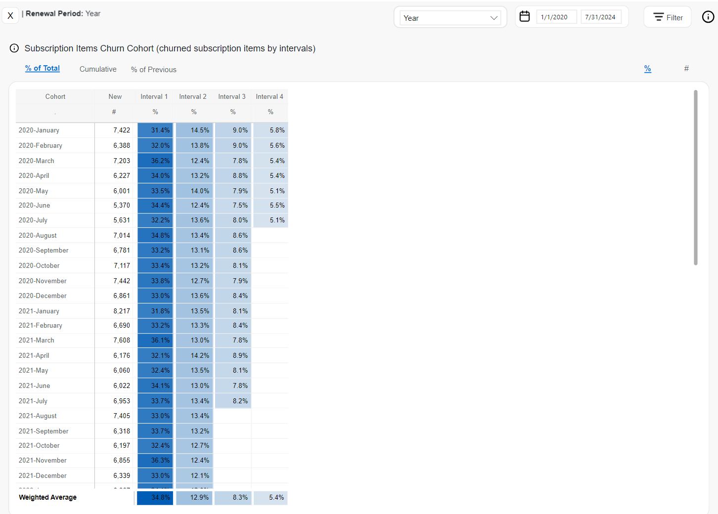
Churn Cohort
Churn Cohort is a group of subscription items for which the churn behavior is tracked across successive renewal intervals. This approach helps measure user retention over time, understand customer lifetime value (CLV), and identify when churn is most likely to occur.
Cohorts are formed based on the month of sign-up, and churn rates are calculated for each subsequent subscription interval. A subscription item is considered churned when its billing date passes and the item has not been renewed. Grace periods are accounted for, and trial subscription items are excluded from calculations.
The following analytics tools are available to analyze Churn Cohort behavior:
The % of Total view displays the proportion of subscription items from each cohort that churned during specific renewal intervals.
- Rate (%) View: Shows the share of churned items per interval out of the original cohort (i.e., the “New” column represents 100%).
- Count (#) View: Shows the actual number of subscription items that churned in each interval.
This format reveals how much churn happens in each stage of the subscription lifecycle relative to the cohort’s total size.
The Cumulative view shows aggregated churn across multiple intervals:
- Rate (%) View: Displays the cumulative churn rate—i.e., how many of the original subscription items have churned up through each interval.
- Count (#) View: Shows the cumulative number of churned items up to the specified interval.
This view helps illustrate how churn accumulates over time and pinpoints when customer drop-off slows or accelerates.
The % of Previous view presents the percentage of churned items at each interval relative to the number of subscription items still active from the previous interval.
This calculation shows interval-to-interval retention degradation, helping identify key points of customer drop-off and periods of increased churn pressure.
Refunds
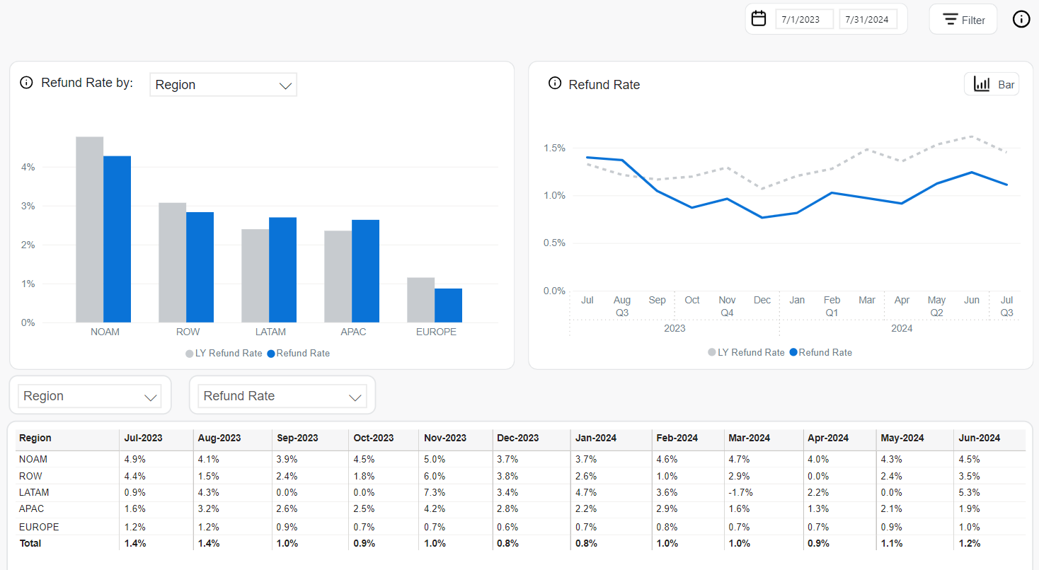
Refund Rate
Refund Rate represents the percentage of completed subscription transactions that were refunded—either fully or partially—within the selected reporting period. This metric provides insight into customer dissatisfaction, product or payment issues, and potential friction in the user experience.
Refunded transactions include valid returns but exclude chargebacks and fraudulent cases (those are tracked separately). The Refund Rate is calculated as:
Refund Rate = Refunded Transactions / Total Completed Transactions × 100%
This metric helps monitor refund trends over time and across different segments to inform operational improvements and customer retention strategies.
The following analytics tools are available to analyze Refund Rate performance:
The Refund Rate by chart visualizes refund performance across various business dimensions. This is a bar chart that can be built using such dimensions as Clients, Products, Renewal Periods, Regions, and other.
- Blue bars: Current Refund Rate for the selected category
- Gray bars: LY Refund Rate (same category, same time period last year)
This view highlights segment-specific refund behaviors and changes over time.
The Refund Rate chart presents time-based trends in refund behavior and supports two visual formats:
-
Line Chart (monthly view):
- Solid blue line: Monthly Refund Rate for the current year
- Dashed gray line: LY Refund Rate for each month
-
Bar Chart (quarterly view):
- Blue bars: Current quarter’s Refund Rate
- Gray bars: LY Refund Rate for the same quarter
This chart supports seasonal trend analysis and comparative performance tracking.
The Refund Rate table offers a granular view of refund rates across selected time periods and business dimensions. It supports advanced filtering and metric controls:
- Dimension Selector: Choose among Region, Country, Product, Payment Type, Interval, and more.
- Metric Selector:
- Refund Rate: % of refunded transactions
- MoM: Month-over-month refund rate change
- YOY: Year-over-year comparison
- Top Filter: Highlights top segments contributing to overall refunds
This table enables precise monitoring of refund behavior and helps identify problematic geographies, products, or payment types.
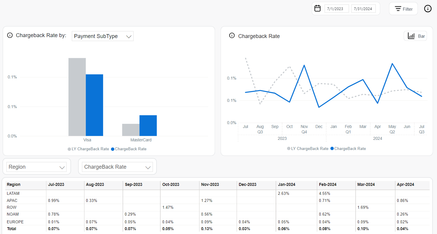
CC Chargeback Rate
Chargeback Rate represents the percentage of paid Visa and Mastercard transactions that were disputed and reversed by customers through their payment providers. This metric is essential for monitoring fraud risk, billing disputes, and product dissatisfaction patterns.
For credit card payments (Visa and Mastercard), the Chargeback Rate is calculated as:
Chargeback Rate = (Visa + Mastercard Chargebacks in Current Month) / (Visa Paid Transactions in Current Month + Mastercard Paid Transactions in Previous Month)
This approach reflects the delay in chargeback reporting for Mastercard transactions and ensures alignment with industry reconciliation standards.
The following analytics tools are available to evaluate Chargeback Rate trends and segment-specific behaviors:
The Chargeback Rate by chart visualizes chargeback performance across selectable business dimensions. This bar chart can be built for different dimensions including Clients, Products, Renewal Periods, Payment Types, and more.
Each category displays:
- Blue bars: Current Chargeback Rate
- Gray bars: LY Chargeback Rate (Last Year’s rate for the same category)
This view helps identify high-risk segments based on geography, payment method, customer behavior, or other chosen factor.
The Chargeback Rate chart shows how chargeback trends evolve over time and is available in two visual formats:
-
Line Chart (monthly view):
- Solid blue line: Monthly Chargeback Rate
- Dashed gray line: Chargeback Rate for the same months in the prior year
-
Bar Chart (quarterly view):
- Blue bars: Quarterly Chargeback Rate
- Gray bars: LY Chargeback Rate per quarter
These time-based visualizations help surface seasonal risk patterns or anomalies in transaction behavior.
The Chargeback Rate table provides detailed breakdowns of chargeback activity by time and business segment. It includes:
- Dimension Selector: Filter data by Region, Country, Payment Type, Client, Product, and more
- Metric Selector:
- Chargeback Rate: % of transactions that resulted in chargebacks
- MoM: Month-over-month change in chargeback rate
- YOY: Year-over-year difference compared to the same period last year
- Top Filter: Highlight top categories contributing most to chargebacks
This tabular view allows for close monitoring and proactive response to chargeback spikes or trends in specific areas.
Managing the dashboard view
The Subscriptions dashboard gives you a flexible way to analyze key metrics across charts and tables. You can customize views with value, YoY, MoM, and total % columns, apply detailed filters, explore Top N values, and interact with charts using drill-up/down options. Detailed tables below each chart reveal the data behind the visuals for full transparency.
Use Dimensions
In the Subscription dashboard, you can view all metrics by different dimensions in both table and chart formats.
These are some of the most common dimensions:
- Client: Filters data by Cleverbridge client name or ID.
- Product: Filters data by the individual product name or ID.
- Product List: Filters by predefined product groups used for specific purposes.
- Recurrence: Filters by whether the product is recurring or one-time.
- Renewal Period: Groups data by subscription renewal cycles (for example, monthly, yearly).
- Interval: Filters by subscription interval number (for example, first renewal, second, and so on.).
- Payment Type: Filters by the method of payment (for example, credit card, PayPal).
- Payment SubType: Further refines payment method (for example, Visa, MasterCard).
- Region: Aggregates data by global regions (for example, APAC, LATAM).
- Country: Filters by billing country.
- B2B / B2C: Distinguishes between business (B2B) and individual (B2C) customers.
- MVT: Filters by Multivariate Testing campaign name or ID.
- Partner: Filters by reseller partners in a B2B sales model.
Additionally, you can configure your tables with columns for value, YoY, MoM, and Total %.
Filters and dashboard management tools
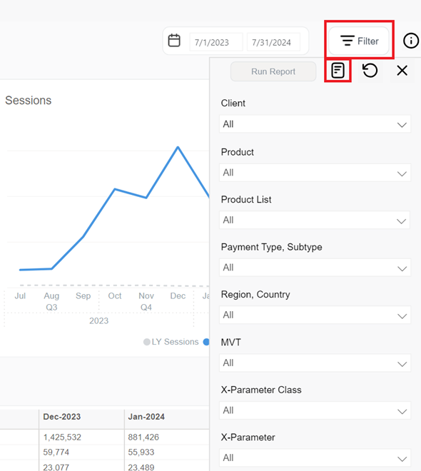
Filters narrow down the data included in your report. They let you focus on a specific segment (for example, one product, specific countries or payment methods) without changing how results are grouped. Basically, filters limit which records are included in the calculation of your metrics and apply to the entire report output.
To apply a filter you need to select a filter it and apply it to the report. These can be:
- Built-in filters: Standard filters with selectable values (for example, client, country, date range).
- Text search filters: Free-text filters where you enter comma-separated values and choose whether to include or exclude matching records.
You can filter the subscription-related data by:
-
Currency: USD, EUR, or GBP
-
Date Range: Month-day-year
-
Order Type: Initial, One-time, or Renewal
-
Client: Cleverbridge client name/ID
-
Product List: a list of products you select and categorize for a particular purpose. One product can be contained in several product lists.
-
Product: Name/ID of the product
-
Renewal Type: Automatic, manual, or non-recurring
-
Renewal Period: Month, year, 2 years, or other
-
Payment Type, Subtype: Payment type and subtype used by a customer
-
Region, Country: World region as defined by Cleverbridge and billing country
-
APAC
- Australia
- China
- Hong Kong
- India
- Indonesia
- Japan
- Malaysia
- New Zealand
- Philippines
- Republic of Korea
- Singapore
- Taiwan
- Thailand
- Vietnam
-
EUROPE
- Albania
- Austria
- Belarus
- Belgium
- Bosnia and Herzegovina
- Bulgaria
- Canary Islands
- Croatia
- Cyprus
- Czech Republic
- Denmark
- Estonia
- Finland
- France
- Germany
- Greece
- Hungary
- Iceland
- Ireland
- Italy
- Latvia
- Liechtenstein
- Lithuania
- Luxembourg
- Macedonia
- Malta
- Monaco
- Montenegro
- Netherlands
- Norway
- Poland
- Portugal
- Republic of Moldova
- Romania
- San Marino
- Serbia
- Slovakia
- Slovenia
- Spain
- Sweden
- Switzerland
- Ukraine
- United Kingdom
-
LATAM
- Argentina
- Bolivia
- Brazil
- Chile
- Colombia
- Costa Rica
- Ecuador
- El Salvador
- Guatemala
- Honduras
- Mexico
- Nicaragua
- Panama
- Paraguay
- Peru
- Puerto Rico
- Uruguay
- Venezuela
-
NOAM
- Canada
- United States
-
ROW
- All other countries
-
-
B2B/B2C: Indicates whether the product was sold to a business (B2B) or a private customer (B2C)
-
Interval: Subscription interval number. See Subscription Interval Number in Subscription statuses and update options.
-
MVT: Multivariate testing campaign name/ID
-
Partner: Another business that buys your products in a B2B model. Partners purchase your products at a discount and then sell them to customers. Partners communicate directly with customers.
You can also apply x-Parameter Class and x-Parameter filters to the following metrics:
-
Revenue > Net Revenue
-
Subscription > Movements, New, Renewed, and Churned
-
Churn > Churn Rate and Churn Type
-
Customer Acquisition > Orders and AOV
-
Performance > All metrics
-
Engagement > Sessions
-
x-Parameter Class: These are your predefined x-Parameter classes. You can have a maximum of five x-Parameter classes per client in the system. When you select an x-Parameter Class filter, it is applied to the metrics and the x-Parameters under the x-Parameter class appears in the x-Parameter filter, which you can further select to refine the metrics. You can select either one x-Parameter class as a filter or all the available x-Parameter classes.
-
x-Parameter: x-Parameter represents origin of your revenue and subscription and there can be a maximum of 10 hierarchical x-Parameters levels in the system. You can select x-Parameter filters to see the subscription/revenue reports. You can either select one x-Parameter as a filter or all the available x-Parameters. For more information on x-Parameters, see Set up x-Parameters and Set up revenue tracking.
For quick access, type the name or ID of the campaign in the x-parameter field. 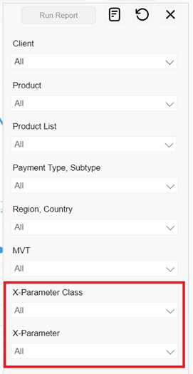
You can also filter data by specific IDs using text search filters. 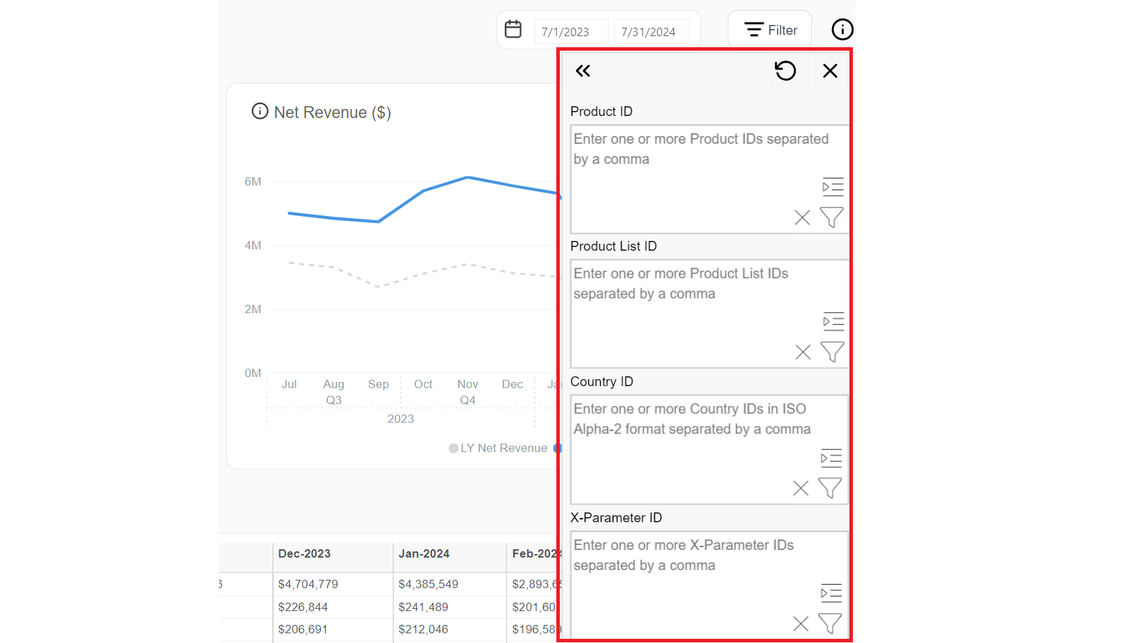
The Subscriptions dashboard supports other tools to help you explore and understand your data more deeply, as described in the Additional filters and sorting tools.