Overview dashboard
The Overview dashboard is a top-level view in the Business Review section. It brings your most important monthly subscription commerce metrics in one place. Instead of focusing on a single KPI, it helps you quickly assess overall business health, identify what changed and why, and jump to deeper reports for investigation.
Access the Overview dashboard
Go to the Analytics section of SCM and select Business Review from the menu. The Overview dashboard is displayed by default. You can also use the link.
If you don’t see the dashboard, reach out to your Client Experience contact to request access.
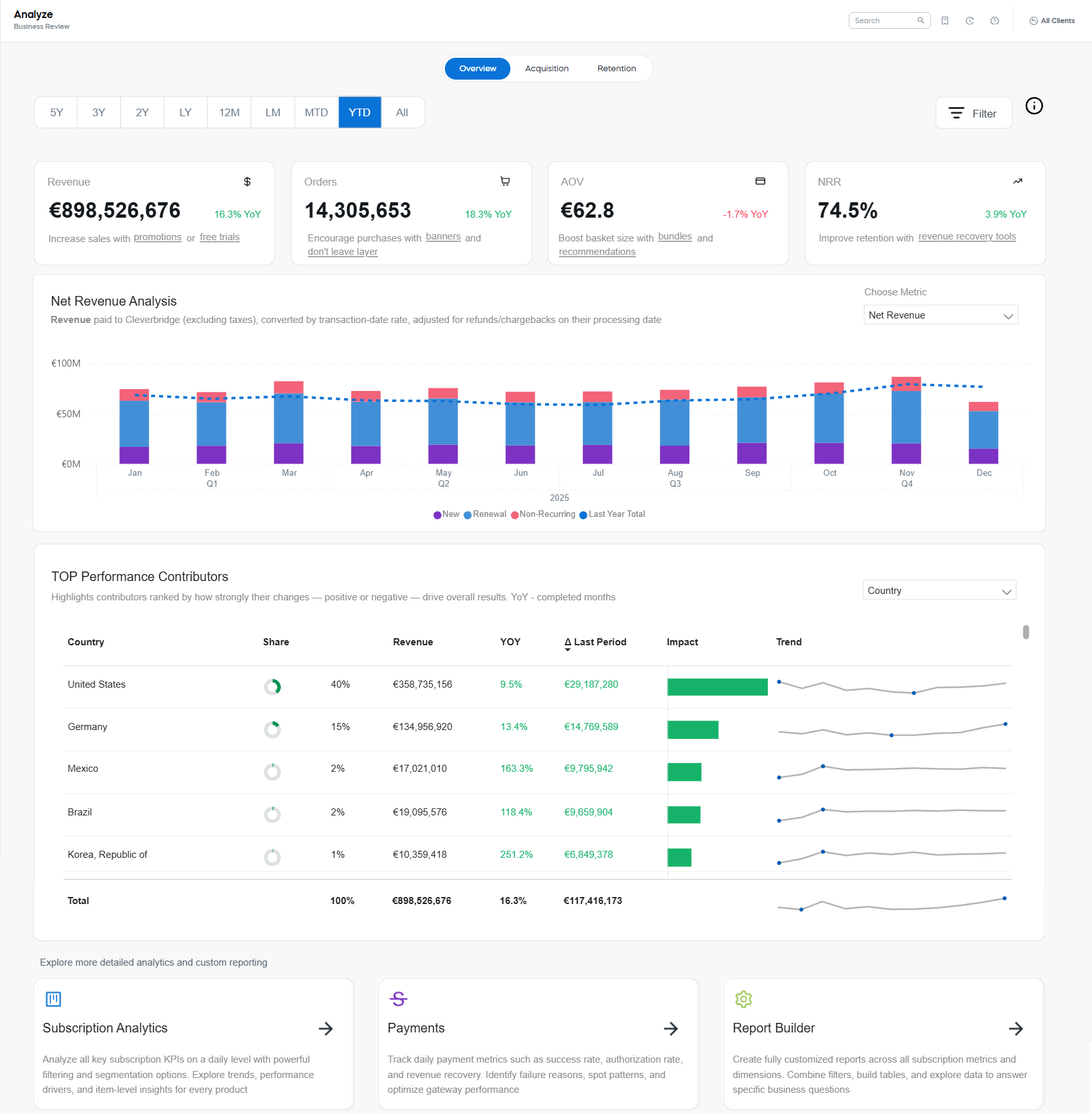
Information available on the Overview dashboard
The page contains a date picker and Filters panel. Below them, there are three main areas: Key Metrics, Metric Analysis representation, and Top Performance Contributors table.
FIlter and date picker
Use the Filter panel to narrow the view (for example, by geography, product scope, or promotion context) and to focus your investigation on the most relevant segments. The dashboard supports main SCM filters and sorting tools. However, there are more years than in other SCM reports, enabling long-term trend analysis (up to 5 years of history).
Use the date picker to access up to five years of historical data. If the range you need isn’t available in the quick presets, use the Month Range setting it in the Filter panel.
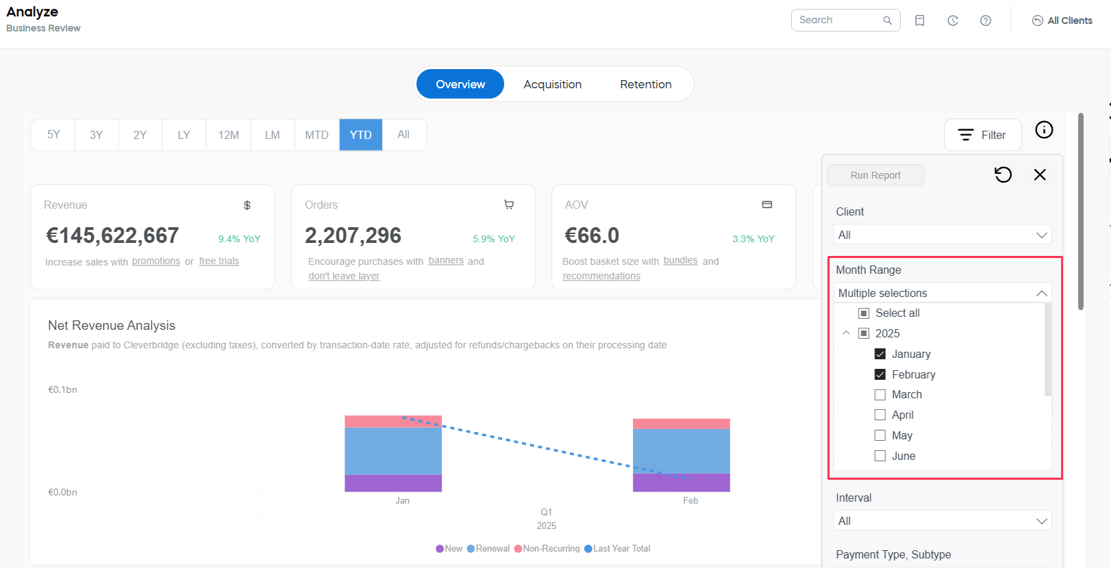
Once you've defined the set of filters, click the Run Report button at the top of the Filter panel. The settings will be applied to all the metrics, tables and representations available on the dashboard.
Key Metrics
At the top, a set of KPI tiles summarizes the most important metrics with YoY indicators and quick guidance.
- Revenue: Net revenue paid to Cleverbridge (excluding taxes).
- Orders: The total number of orders after returns due to chargebacks and full refunds.
- AOV: Average order value.
- NRR: Net revenue retention.
Colored YoY value next to each KPI shows the change versus the same period last year. Green indicates an increase, and red indicates a decrease.
Extend key metrics
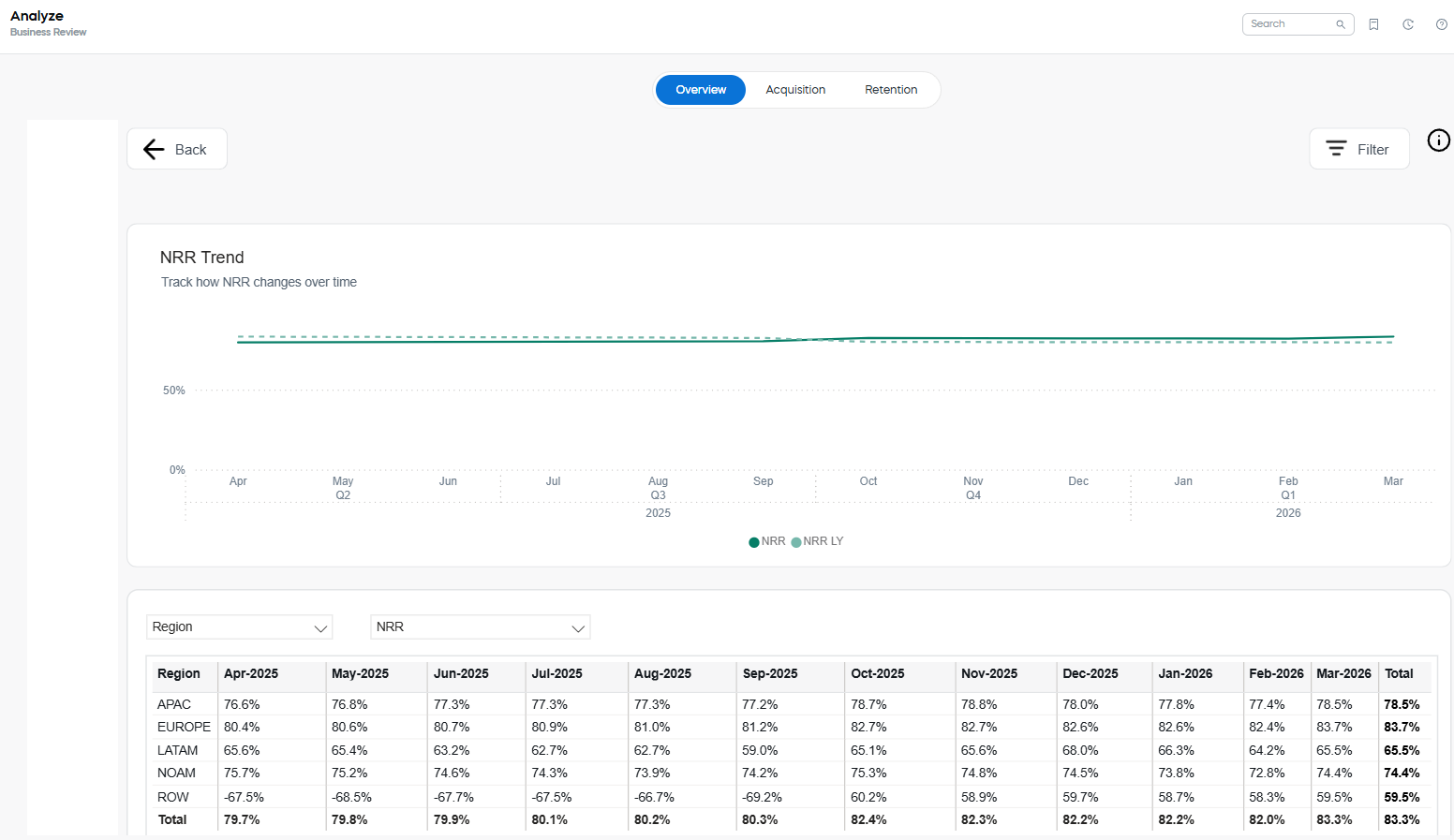
Every key metric can be expanded to review details with trend line. 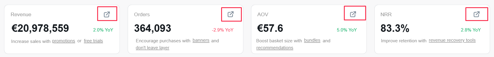
The graphs correspond to those available in the corresponding sections of the Subscription Analytics. For example, these are Net Revenue Retention Trend details:
Metric Analysis
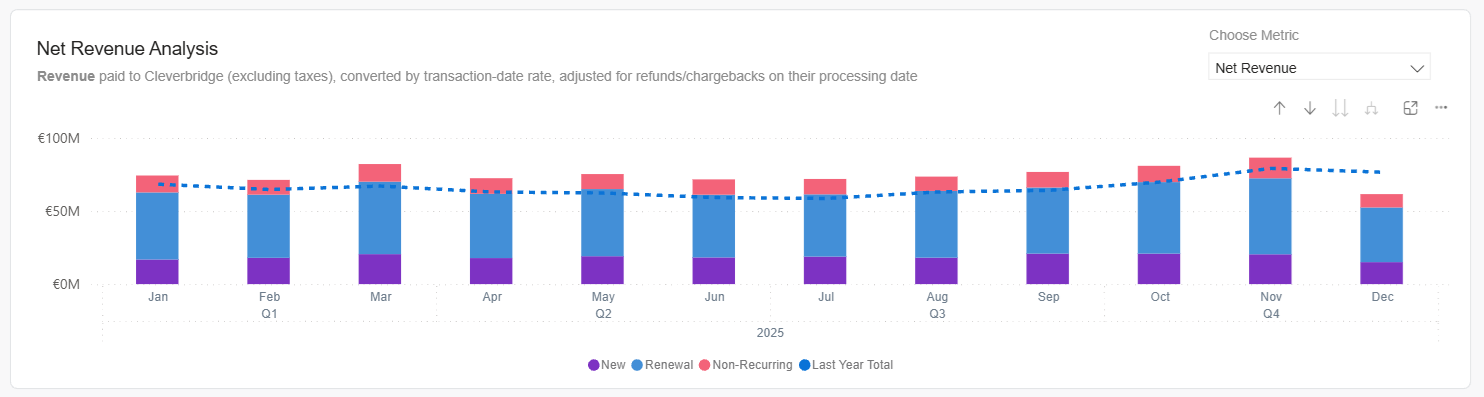
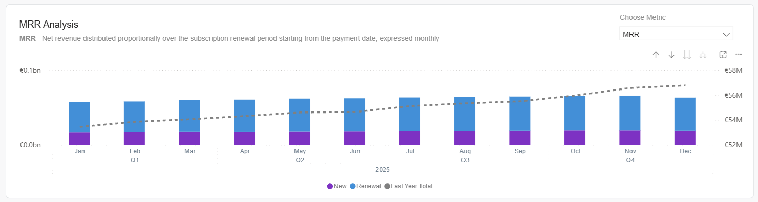
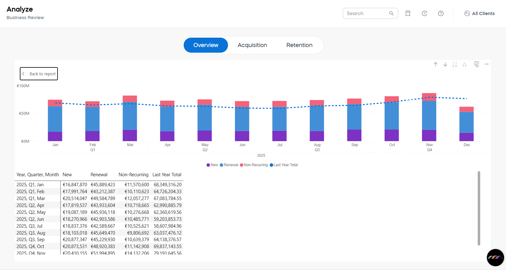
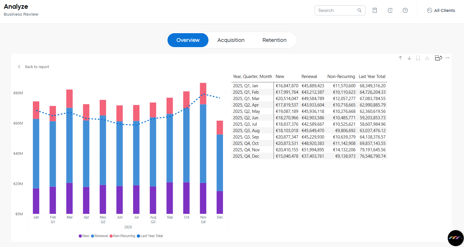
Switch the metric using Choose Metric to explore the metrics below by month. Stacked bars (where applicable) show New, Renewal, and Non-Recurring contributions; a dotted line overlays last year’s total for context.
Each selection shows a short description and links to the dedicated documentation page for that report/dashboard.
- Net Revenue — Revenue paid to Cleverbridge (excl. taxes), converted by transaction-date rate and adjusted for refunds/chargebacks.
- MRR — Monthly Recurring Revenue recognized proportionally over the subscription period.
- ARR — Annualized Recurring Revenue derived from active recurring subscriptions at the selected point in time.
- NRR — Net Revenue Retention reflecting retained/expanded revenue versus churn and contractions for existing subscribers.
- Orders — Count of orders in the period.
- AOV — Average Order Value (revenue ÷ orders).
- ARPU — Average Revenue per User (revenue ÷ unique purchasers/subscribers depending on scope).
- Active Subscribers — Unique subscribers with at least one active subscription in the period.
- Active Subscriptions — Count of active subscription contracts in the period.
Right-click any visual and choose Show as table to view and copy the underlying values.
You can also switch the table into the vertical mode.
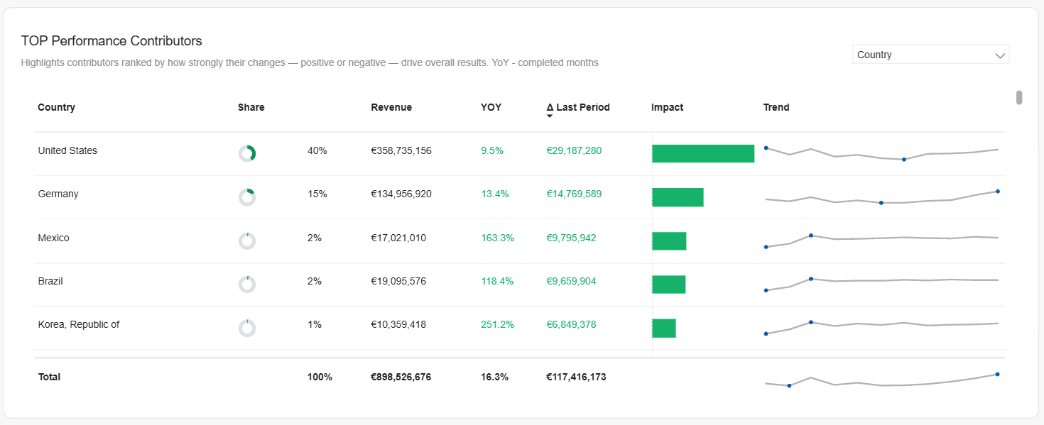
Top Performance Contributors
This visual highlights which segments had the largest impact (positive or negative) on results versus the last period, helping you quickly find drivers to investigate.
Top Performance Contributors report parameters
Dimension
At the top right corner of the report area you can select the dimension.
Switching dimensions helps you quickly see what is driving results and where to investigate next. By comparing segments side-by-side (e.g., regions or payment methods) you can isolate growth tailwinds, spot conversion or refund issues, and quantify each segment’s impact versus the last period. The following values are available:
- Client: A specific company/account whose commerce runs through Cleverbridge.
- Client Group: A logical grouping of clients (e.g., brand family, business unit, partner cluster).
- Country: The shopper’s billing/transaction country.
- Region: A broader geographic area composed of multiple countries (e.g., North America, EMEA).
- Product: An individual catalog item/SKU.
- Product List: A curated set of products (e.g., a suite, plan family, promotional bundle list).
- Payment Type: The primary payment method category (e.g., Credit Card, PayPal, Wire Transfer).
- Payment SubType: A more granular method variant (e.g., Visa vs. Mastercard; local wallets).
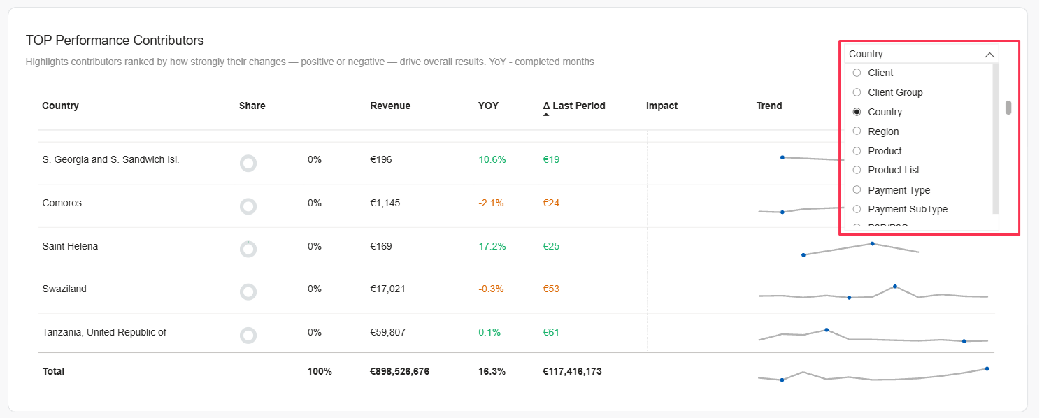
You can also use the Filters panel to narrow the view by Country/Region, Client/Client Group, Payment Type/SubType, etc.
Other table columns
Based on the selected dimension, you can see the break-down for the following values.
- Share: The segment’s portion of total revenue in the current view (e.g., “40%” = this segment accounts for 40% of the filtered revenue). Useful for context—small share with big growth vs. large share with modest growth.
- Revenue: Net revenue for the segment in the selected period and filters (excludes taxes; FX converted by transaction-date rate; adjusted for refunds/chargebacks on their processing date).
- YoY: Year-over-year change for the segment over completed months in the selected period (percentage vs. the same months last year with the same filters).
- Δ Last Period: Absolute revenue change vs. the immediately preceding comparable period within your current date range (e.g., this month vs. last month; YTD vs. prior YTD). Greens indicates positive changes, i.e. gain, and red – negative.
- Impact: A visual bar showing how much this segment contributed to the overall revenue change in your dashboard view. Segments with the largest positive/negative contributions appear highest when the table is sorted by Impact.
- Trend: A sparkline of the segment’s month-by-month performance across your selected period—great for spotting inflections, seasonality, or sustained shifts.
Initially, the items are ordered by impact (Δ Last Period), so the largest movers appear first. You can switch to other parameters to tailor the table to your needs.